Lead Generation Forms: 50 Strategies, Ideas & Best Practices Part 3
35. Digital Marketer
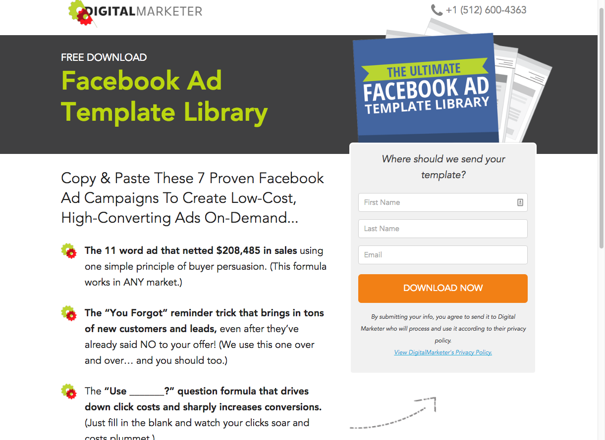
DigitalMarketer knows their way around a landing page. This example comes from their Facebook Ad Template Library landing page. Let’s see what tactics they use to highlight their form and make it convert.
- Qualifying question at the top of the form “Where should we send your template?” is a great justification for collection information from visitors.
- Simple and clear CTA “Download Now” tells visitors they should immediately receive their copy.
- A subtle yet encapsulated design to highlight the form on the page.
- A direction cue arrow below the form leads the visitor eyes right to the start of the form.
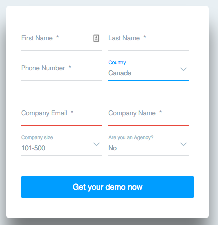
36. Bottom of page: Falcon.io
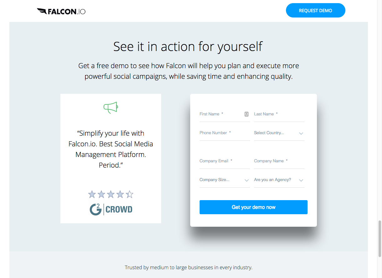
Falcon.io, the social media management tool, puts friendly user design at the forefront of its landing pages and it’s not different when it comes to their forms.
To collect leads for their tool they offer a full product demo on their landing page. Let’s see what makes their form so effective.
- Brilliant drop shadow that makes the standout on the page.
- Colourful and action oriented CTA “Get your demo now”.
- Symbols and graphics on the left hand side to quickly get their social and client testimonials across.
- Speedy drop down menus instead of form fields to make a longer form easier to handle.
- Colour coded error displays. Red underlines the fields that have errors for easy correction.
37. Click Popup: Amy Porterfield

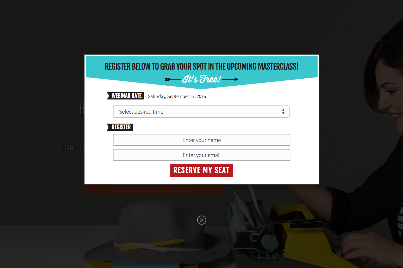
Amy Porterfield, the social media marketing guru, employs a click popup form on her webinar registration page.
Let’s talk about what her click popup form is doing to collect leads.
- A large and professional hero image on the landing page adds to the credibility of the Amy Porterfield brand.
- A click popup form saves having to redirect visitors to separate page for registration.
- Clear and action oriented CTA “Reserve my seat” is exactly telling of the next step.
- A simple drop down menu to select the webinar time gets extra points for usability.
I would like to see more design continuity in the landing page and the click popup form. The change in colours and fonts may be a little confusing for some visitors. For example, a bright and large CTA like the one on the landing page may perform better on the form.
38. Delta DNA
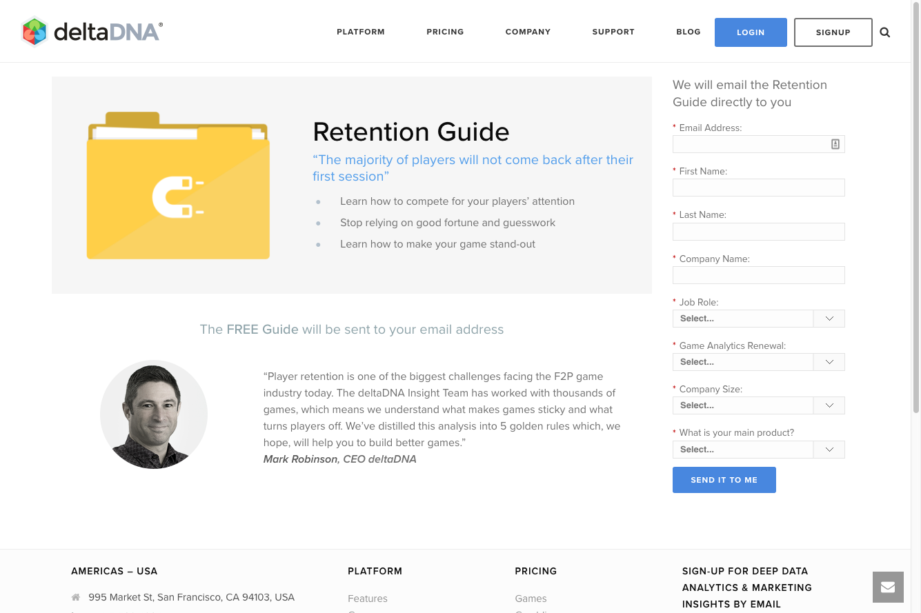
The data analytics and real-time marketing software, DeltaDNA, captures leads by offering their comprehensive Retention Guide.
What is DeltaDNA doing to drive conversions on their form?
- They make it painfully clear that your Retention Guide will be emailed right to your inbox the second you submit the form.
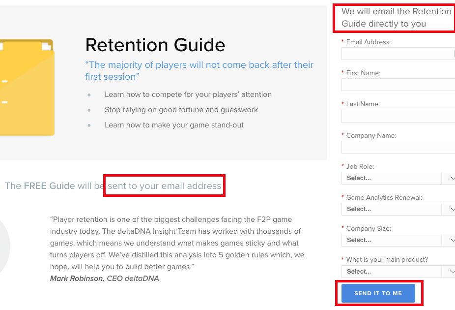
- Red (*) marks all the important form fields for the user.
- Drop down menus at the bottom make the form a little easier to digest.
- A big and bright CTA with action oriented language finishes off the form perfectly.
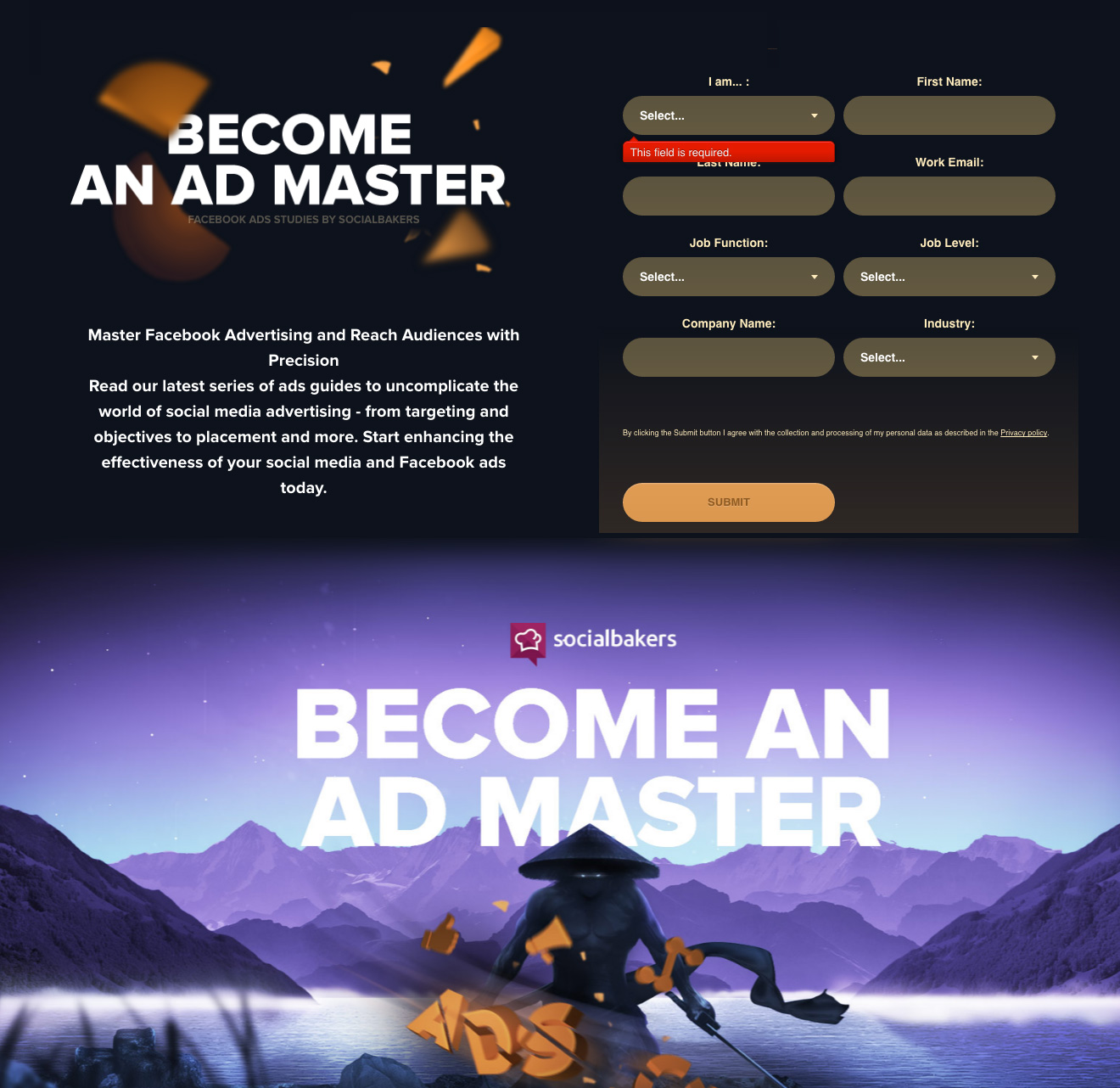
39. Social Bakers
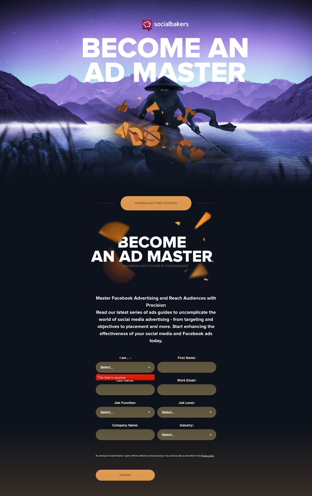
Here we have a landing page from SocialBaker that appears to be well put together on first glance but would benefit from a redesign.
The form itself would most likely convert better if it was placed above the fold along with all the body text.The offer/lead magnet is not immediately clear unless you’ve read the body text. To help with this the page could be reorganized. Images and symbols could be used to make the offer immediately clear.
Without much content on the page it’s clear that the space could be used more efficiently like in the example below. Information and design hierarchy are crucial parts of the user experience.
40. MuleSoft
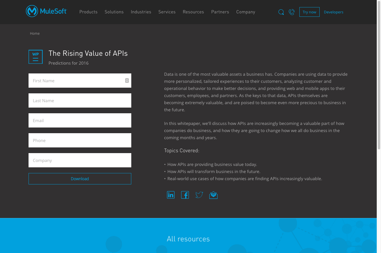
To promote their whitepaper “The Rising Value of APIs”, MuleSoft created this landing page to capture leads.
Let’s take a look at what they’re getting right with their lead collection form.
- Prefilled fields to help users fill in the form correctly.
- Simple design and eye pleasing colour scheme
- Highlighted CTA button with a somewhat clear call-to-action “Download”
To improve, MuleSoft may want to make their offer more clear. By bolding the second body text paragraph and the bullet points it would be much more clear what the user is signing up to receive. This info could be added to the headline of the form for more clarity. The CTA could also be more action oriented simply by adding “Download Now”.
41. Percolate
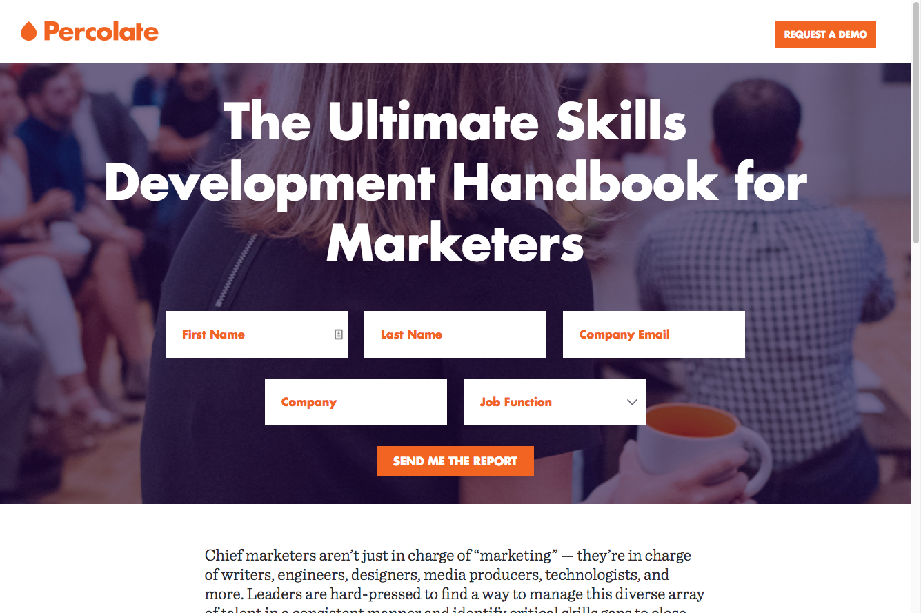
To get their ebook “The Ultimate Skills Development Handbook for Marketers” into the right hands, Percolate set up this big and in-your-face form on their landing page.
What are they doing to drive downloads?
- Big bold hero image to grab attention.
- Bright orange colour on all the form fields and button.
- Descriptive headline.
- Action oriented CTA text “Send me the report”.
- Drop down job function menu for simple answering.
- Above the fold area for highest visibility.
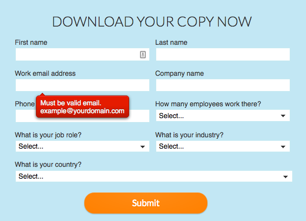
42. Vision Critical
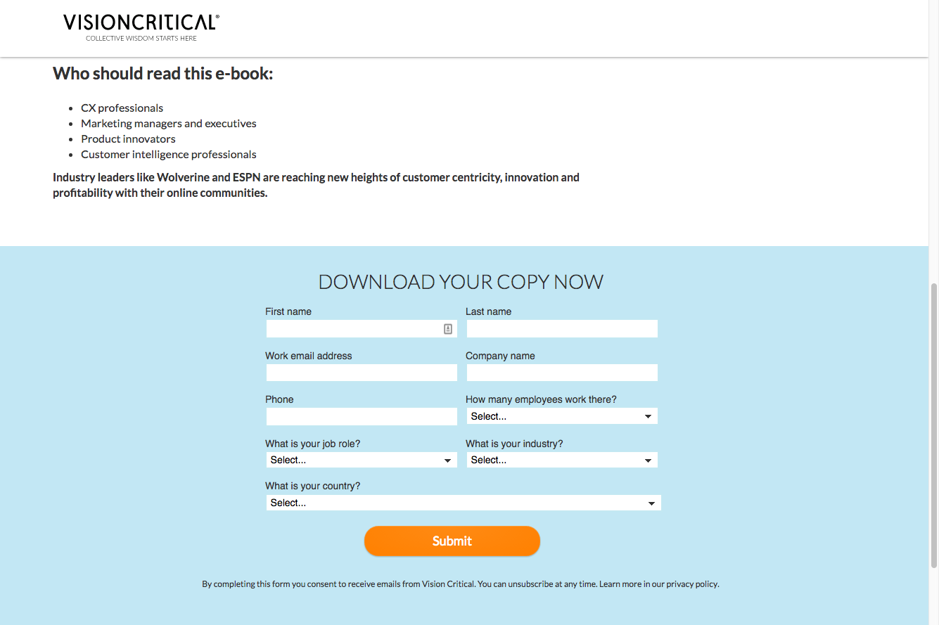
To teach enterprise companies a thing or two about online communities, VisionCritical uses this landing page to offer up its ebook “The Enterprise Guide to Online Communities”.
Let’s see what they’re doing to capture leads.
- Bright background colour that makes the form stand out from the rest of the page.
- Bright and bold CTA to submit the form.
- Drop down menus to make form filling a little easier.
- Loads of insightful commentary at the top of the landing page to lead visitors down to the form.
- Real-time error messages with helpful suggestions.
The only suggestion to be made would be to move the form above the fold or closer to the top so that it can be seen by more people. The CTA text should also match the headline text “Download” and not “Submit” for more congruence.
43. Exit Popup: Magnet4Blogging
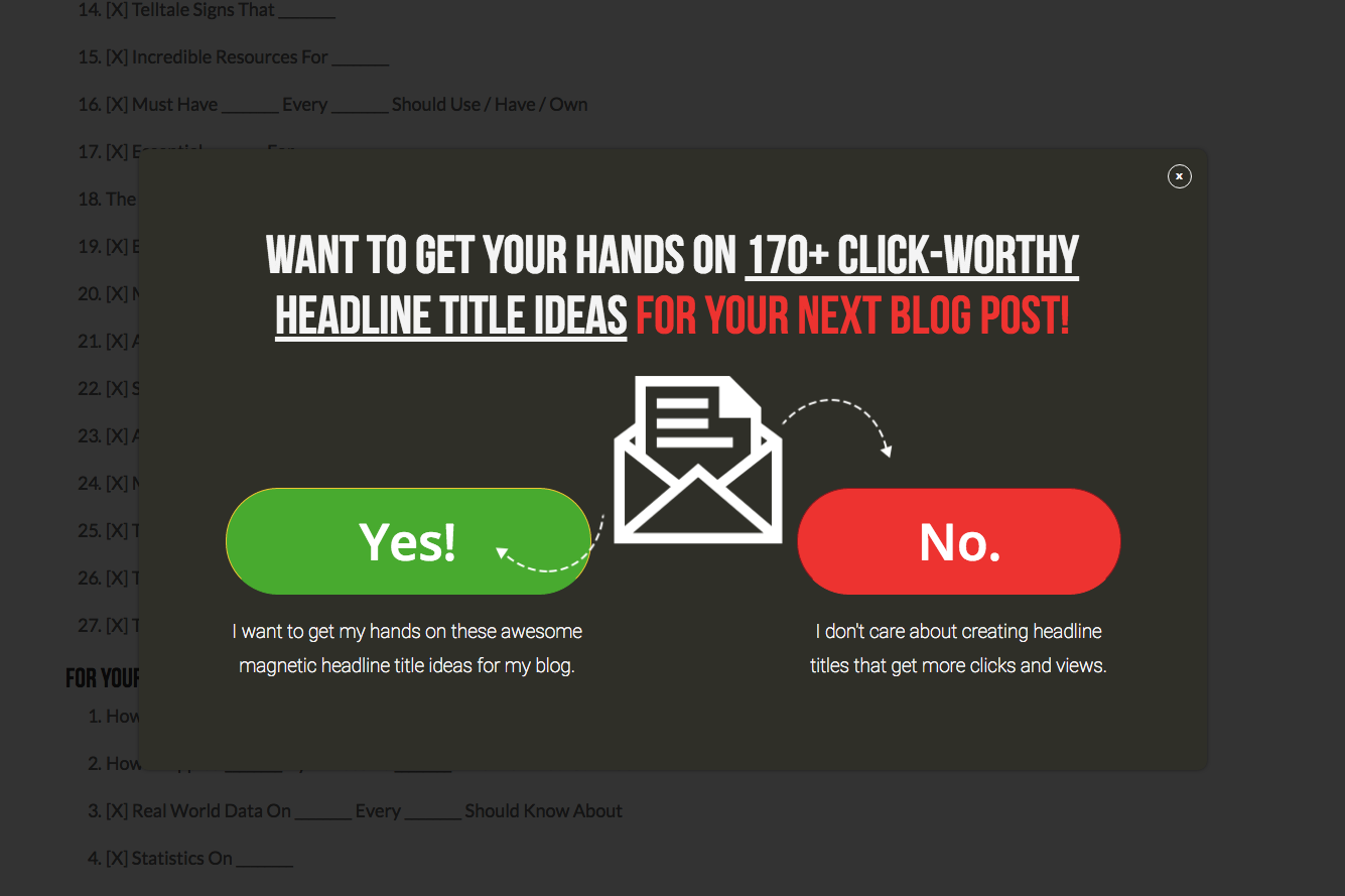
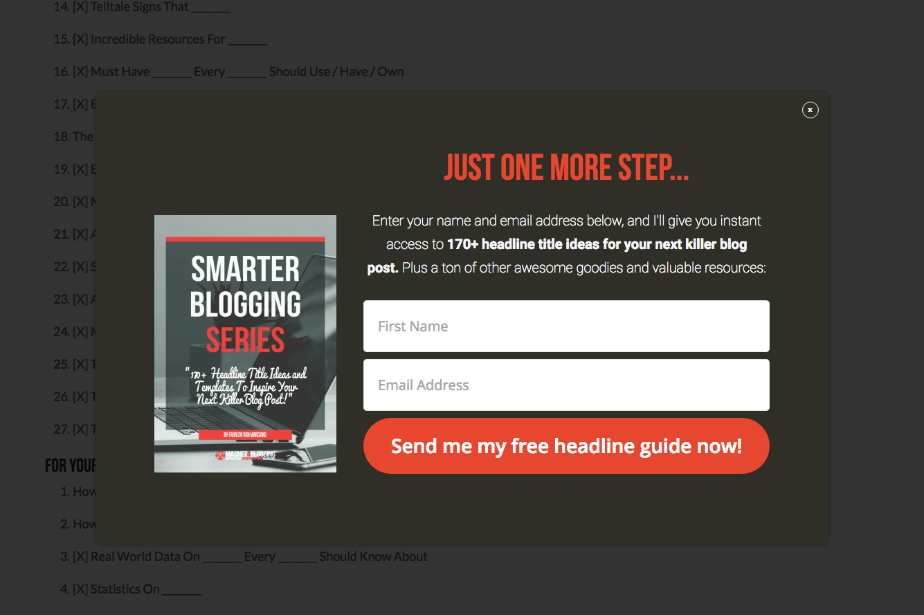
To collect leads with their ebook “170+ headline title ideas for your next killer blog post”, Magnet4Blogging uses an 2-step exit intent popup form.
Let’s discuss why this is an effective form.
- A qualifying headline lets users know that there is just one more step in the opt-in process.
- Bolded body text highlights the ebook title and makes the offer more prominent.
- The thumbnail image of the ebook cover adds to the credibility of the form.
- An action oriented CTA button stands out from the form and draws the eye in.
44. Four Hour Work Week
45. Zebra
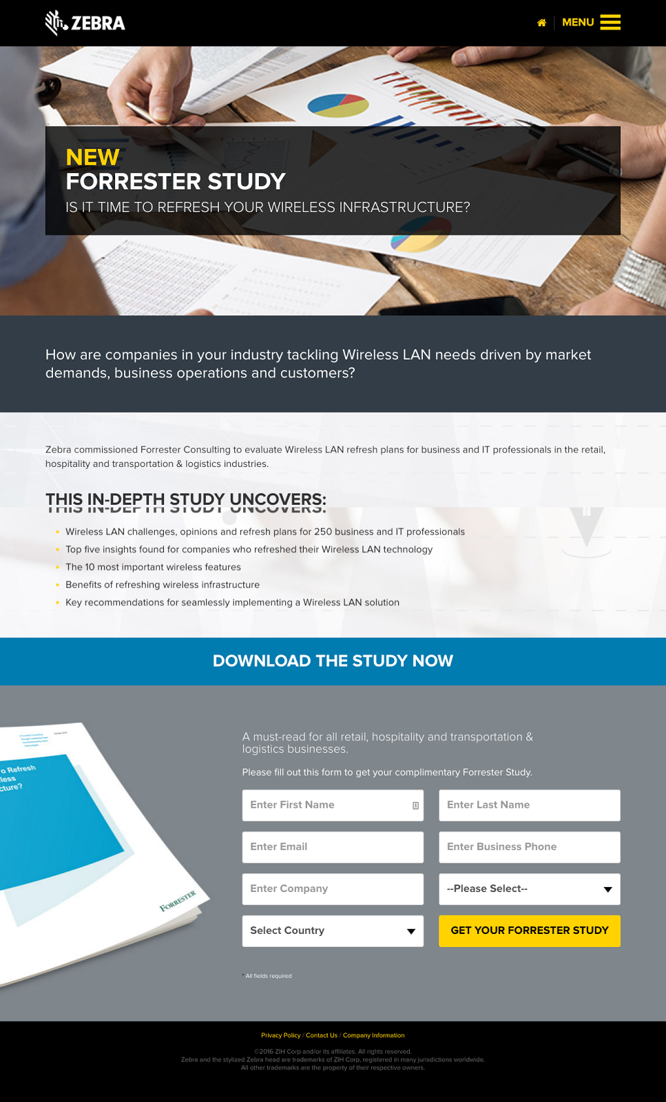
Zebra, the enterprise networking company, hired Forrester to conduct a comprehensive study on wireless challenges for large businesses. It then used the Forrester study as a valuable lead magnet to collect leads on this landing page.
What is Zebra doing right with their landing page form?
- A qualifying sentence at the top stating that the study is must-read for all retail, hospitality and transportation businesses.
- Drop down menus for a friendlier user interface
- Bright and bold CTA with action-oriented language
- Big graphic on the left hand side for an almost tangible feel to the offer.
46. Entry/Timed Popup on https://curationsuite.com/product-news/case-study-blueprint-authoritative-site-built
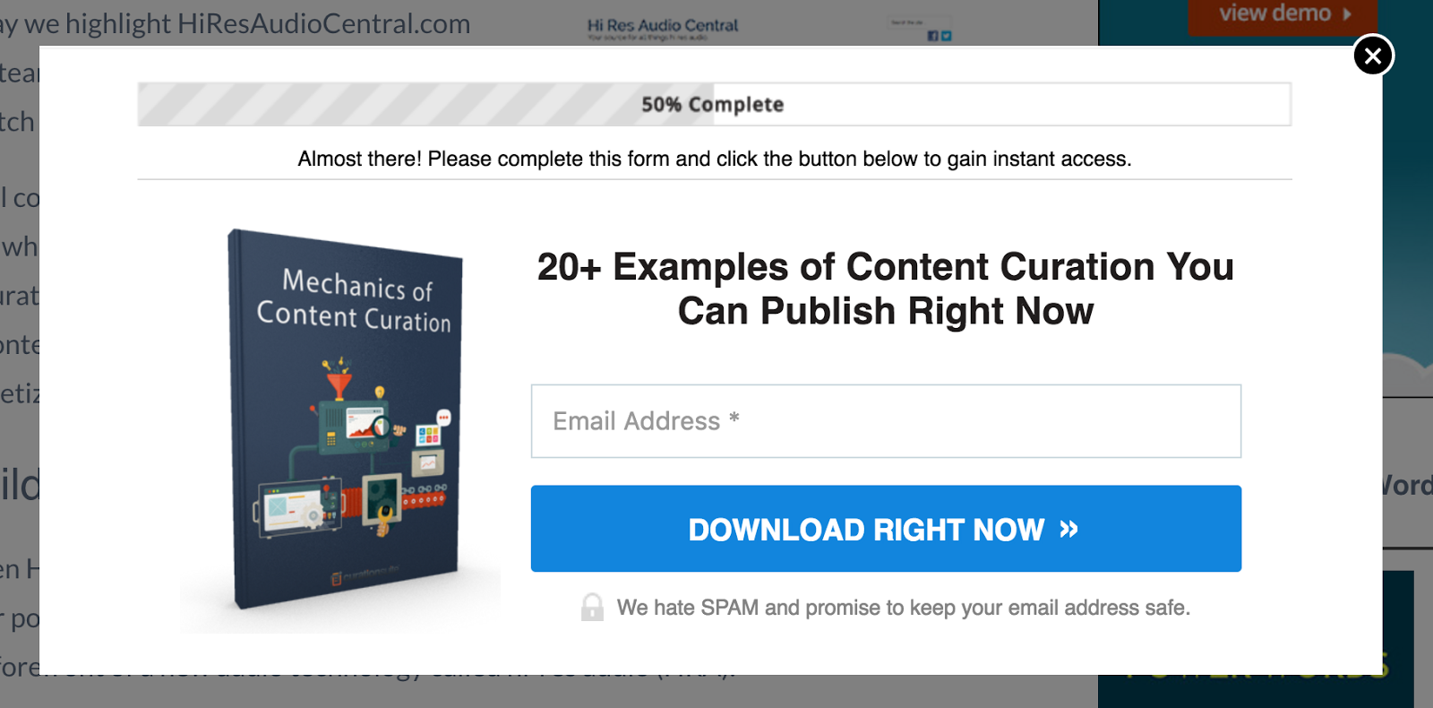
To get them more leads that excited about curating content online, CurationSuite, uses their ebook “20+ examples of content curation you can publish right now”. They promote this ebook on their blog through the use of popup forms.
What makes their popup form so effective?
- The progress bar at the top tells users there’s only one step left and opting in is already 50% complete
- The thumbnail image gives users a tangible look at the offer they’re about to receive
- A big and bold CTA with action oriented language “Download right now” tells users exactly what is taking place next.
This popup does mention spam below which may or may not harm the conversion rates.
47. Wordstream
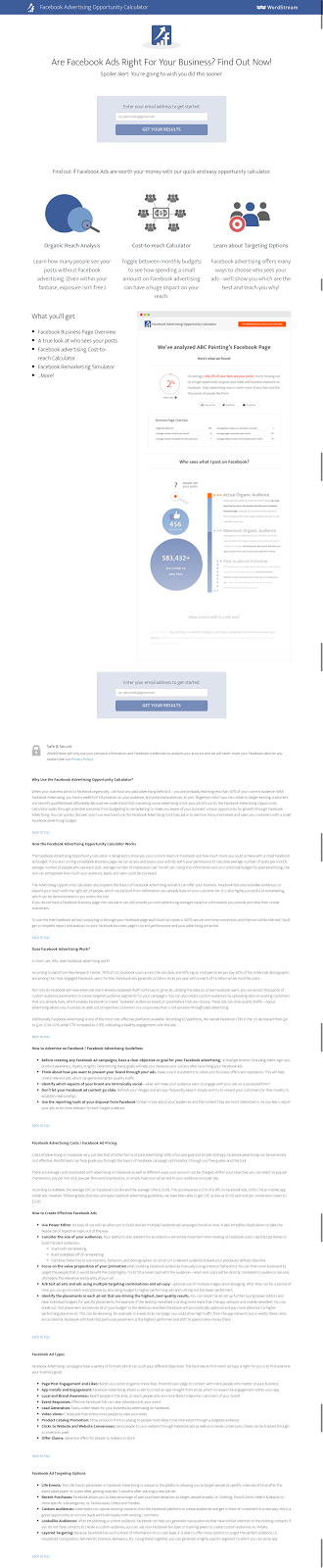
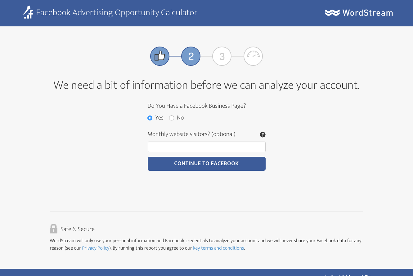
WordStream, the PPC management platform, is no stranger to generating leads with high quality content offerings. To attract leads interested in Facebook advertising they’ve set up a Facebook advertising opportunity calculator to collect information from visitors. Visitors can enter in their email and Facebook information and be delivered a visualized report on whether or not Facebook ads are right for their business.
What is WordStream doing right with their lead collection form?
- A compelling landing page designed styled in a Facebook-like way.
- Thorough visuals and concise information on the report users will receive.
- A step-by-step graphic to tell users where they are in the opt-in process.
- Action oriented CTA language “Get your results”.
48. Microsoft Office
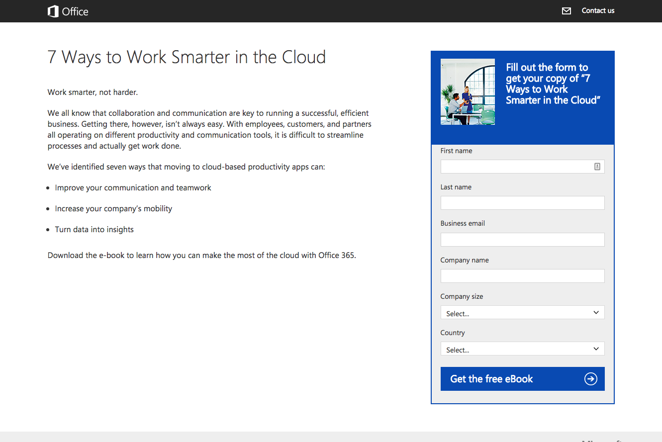
Work smarter, not harder says this Microsoft Office landing page. Fill out the form on this landing page a receive the Microsoft Office landing page “7 ways to work smarter in the cloud”.
What is industry giant Microsoft doing right with their landing page form?
- Clean and clear design with a design focused on the form.
- Precise headline asking for users to fill out the form and receive their copy of the ebook
- Drop down menus for a friendlier user interface
- Action oriented CTA “Get the free ebook” and a direction cue arrow.
49. ClickFunnels
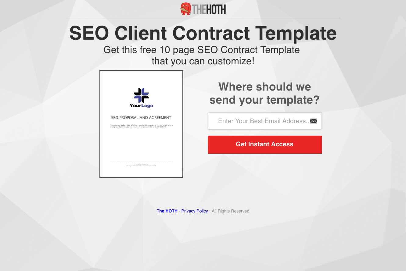
To receive this free 10 page SEO contract template that you can customize, you’ll have to hand over your email to The Hoth for instant access.
What is The Hoth doing right on this landing page form?
- A thumbnail image of the contract templates you’ll be receiving.
- The question above the form field to ask where you’d like your template to be sent.
- The bright red CTA button to draw attention.
50. SmartPassiveIncome
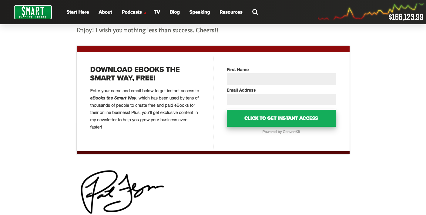
Pat Flynn the podcaster and internet marketer, uses this landing page to offer up his lead magnet “eBooks the smart way”. It’s all part of Pat’s formula to help more people make money and live financially independent.
What is Pat doing right with his landing page form?
- The form is encapsulated on the page to make it stand out.
- A bright green CTA with action oriented language “Click to get instant access”.
- Uses the word FREE throughout the landing page to entice visitors.

Wishpond’s 1000+ Lead Generation
Strategies, Ideas, Best Practices & Examples
Click below to download the most comprehensive collection of lead generation strategies and examples ever compiled. Completely free.