
Lead Generation Marketing: 100 Strategies, Ideas and Examples Part 4
46. Use Exclusivity
Just as no one wants to be the first to join (Lead Generation Strategy #3), no one wants to be left out either.
Creating an element of exclusivity (primarily within your webinars or conferences) is a crucial element of psychological optimization. Exclusivity is the subjective belief that something which has been limited has more value that something offered free of limitation. You want your landing page visitors to feel (legitimately) that if they don’t convert now, they might miss the chance.
It’s a similar thing to urgency – trying to get your visitors to understand that they need to convert now or never.
Here’s an subtle example from Amy Porterfield (300+ webinars under her belt and a 7-figure company built upon them):
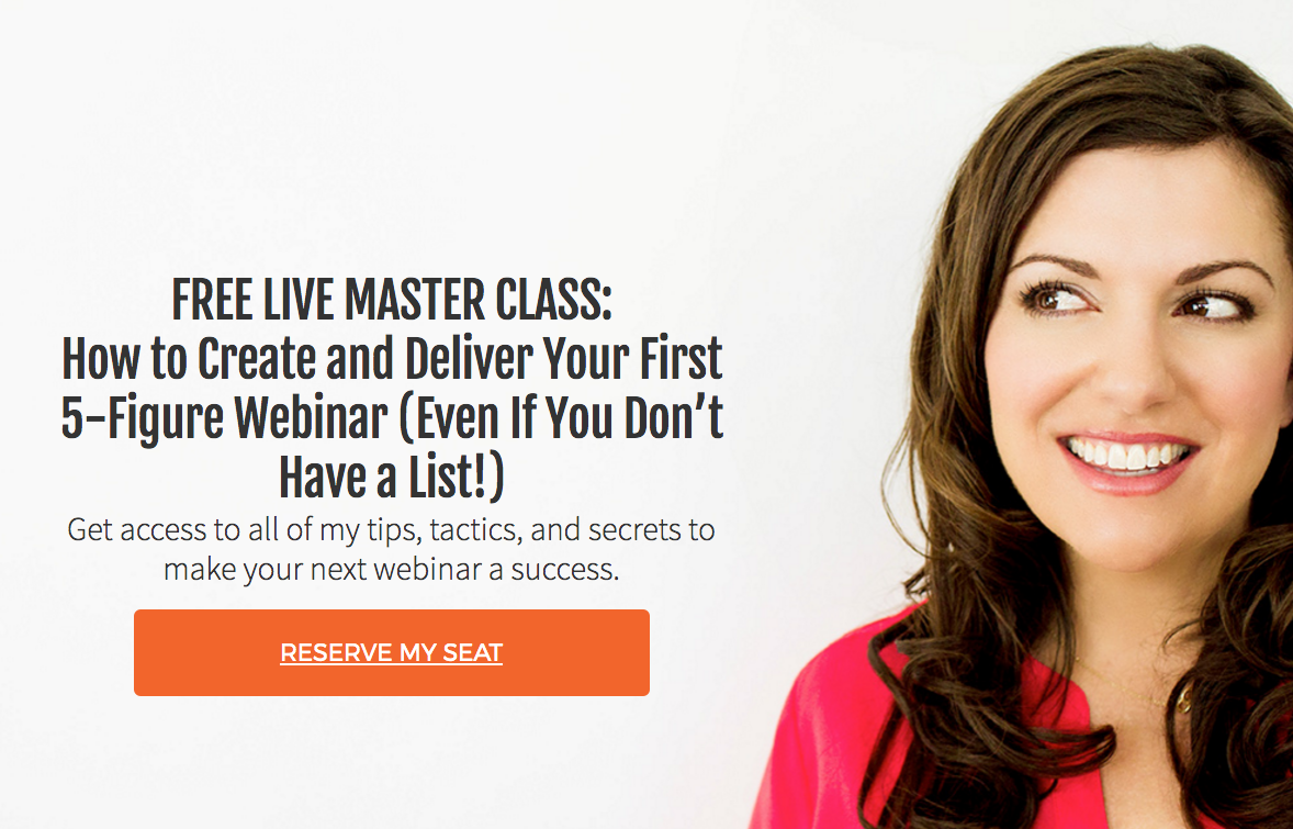
She uses the CTA “Reserve my Seat” to imply (in the same way it does at a restaurant) that if you don’t, your seat will be taken.
To learn more about using exclusivity, check out “Chapter 1 of the Ultimate Guide to Conversion Rate Optimization.”
47. Use Graphics to Represent Digital Content
Words are ephemeral. They’re difficult to grasp onto and value must be imagined.
Products are concrete – the feel of a T-Shirt or the roar of a new car’s engine.
It’s no wonder, then, that “67% of consumers consider clear, detailed images to carry more weight than product information or customer ratings.” (Source)
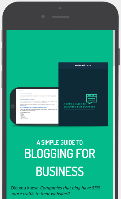
For example, here’s a mobile preview of one of our lead generation landing page templates:
To learn more about using graphics in lead generation, check out It’s All About the Images [Infographic] from MDG Advertising.
48. Progress Bar in Popups
The endowed progress effect is a psychological element of conversion optimization whereby “people feel they have made some progress towards a goal then they will become more committed towards continued effort towards achieving the goal.”
In other words, it’s that feeling of having invested in something and wanting to see it through.
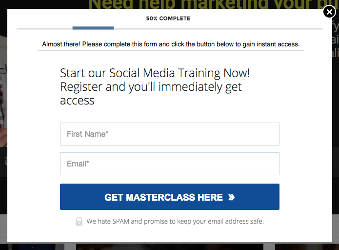
In lead generation terms, it applies most clearly to a click popup, like this one from RazorSocial:
To learn more, check out “Lead generation forms: Five uncommon strategies to increase conversion rates.”
49. Use Click Popups Instead of Landing Pages for Content Upgrades
Click popups can be engaged with and converted upon without the need for a new tab or window, and that seriously drops the amount of friction – which increases conversion rates.
We’ve been doing click popups with our content upgrades (and some relevant ebooks) for the past 9 months or so, and we’ve seen double the conversion rates for those click popups than we do for those same content upgrades offered within landing pages.
Here’s the graph of our email-gated click popup conversion rates vs landing pages:

To learn more, check out “How We Doubled Blog Lead Generation with Click Popups.”
50. Make your Value Proposition Address a Pain Point
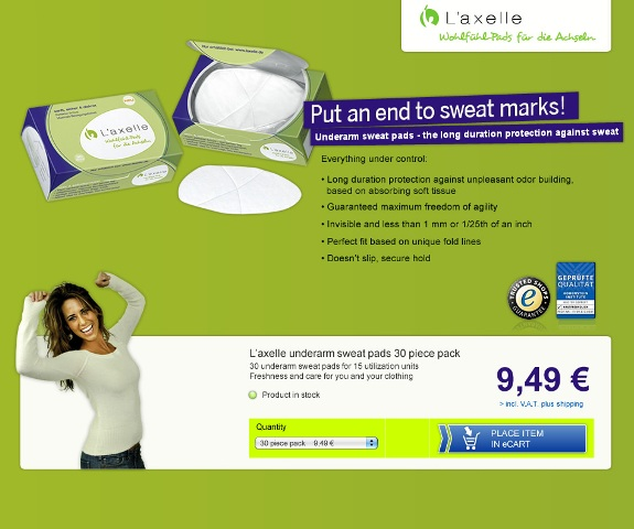
L’Axelle wanted to test their product page headline for their new “underarm sweat pads.” Initially they had “Feel Fresh Without Sweatmarks (comfort-based value).”
When they tested “Put an End to Sweatmarks” (problem-solving value) they saw a 93% increase in conversion rate:
To learn more, check out #2 within “Kissmetrics’ 100 Conversion Optimization Case Studies resource.
51. Curiosity Gap
In 2009, a behavioral study, showed that “subjects spent more scarce resources (either limited tokens or waiting time) to find out answers when they were more curious.”
This is common sense, of course, but when people identify a “gap” between what they know and what they don’t, they’re likely to take action to fill that gap. The study went on to show that when they do fill that gap, pleasure receptors in the brain are triggered.
Consider this for an upcoming webinar or ebook landing page. If your offer intrigues people (perhaps with “never-before-seen” data or insight) you’ll increase the chance of those people committing to find out what information is (fill the gap).
To learn more, check out #14 within Chapter 6 of the Ultimate Guide to Conversion Rate Optimization.
52. State the Dollar Value
Our culture works in dollars and cents. We want to know what things are worth, otherwise we’ll guess (and usually guess low).
If your lead magnet has a dollar value (like a course or academy which previously cost to register) make it central to your value proposition. After all, what is a value proposition except an explanation of the value of an offer?
Here’s an example from Neil Patel’s marketing course on the Quicksprout blog (and Neil tests everything, so you know it works):
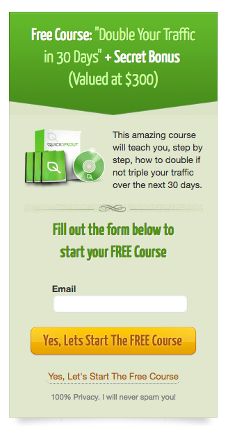
To see this example in action, check out The Quicksprout Blog sidebar course.
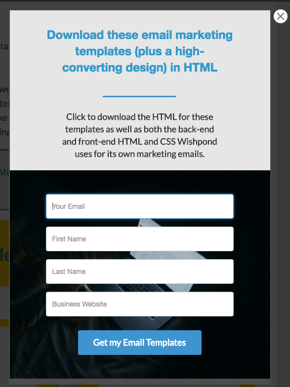
53. Make your Click Popups Explicit
Just because your popup CTA makes it clear what people are going to get when they click (a click popup) doesn’t mean you should just have a blank form appear.
Best practice for click popups is to repeat exactly what the CTA button or link said – consistency is key in lead generation.
Here’s an example of click popup CTA text for a content upgrade:

And here’s the corresponding click popup:
To learn more, check out “How We Doubled Blog Lead Generation with Click Popups.”
54. 5 Why’s Method
The “5 Whys” method is a strategy to determine the pain point of your target market in order to better address it with your lead generation offer, or at least its title.
It has you, as the content creator or communication head, asking yourself five whys, starting with the surface level (in the same way an eight-year-old might pester you from the back seat of the car). For instance:
Surface-level issue: Their inbound marketing efforts aren’t generating leads.
You: Why do you want to generate more leads?
Prospective User: To turn them into sales.
You: Why do you want to more sales?
Prospective User: To make more money.
You: Why do you want to more money?
Prospective User: So that my business becomes successful.
You: Why do you want your business to become more successful?
Prospective User: So I can take more time off to spend with my family.
You: Why do you want to take time off to spend with your family?
Prospective User: So I can do the things in life that truly make me happy, and so I know all the work I have put in hasn’t been for nothing. So I know I’m providing a meaningful, valuable service to people.
This is an exercise in getting down to the nitty gritty of your target market’s motivations. It’s an excellent idea before you start creating an ebook or course.
To learn more, check out “How to Identify Your Customer’s Pain Points.
55. Have Multiples of the Same CTA
That might be a bit confusing. I’m not telling you to have multiple CTAs (that would defy the whole point of a landing page as having a single focus point).
Instead, what I’m telling you is to give your landing page or website visitors multiple options to convert at any time that they’re sold. Your CTA should not just be at the top or the bottom. It should be, in the words of Neil Patel “after each persuasive technique [to increase] the likelihood of a conversion at other points throughout the page.”
Check out Wishpond’s landing page product page:
56. Speak with Authority
You are an expert in your field, even if you don’t feel like it.
If you’re content or lead magnet is at all educational, you’re an expert.
So don’t dance around it. If you’re putting up a guide to Facebook marketing, make it the Most Comprehensive Guide Ever Created on Facebook Advertising.
Make it “The Best,” not “Some of the Best.” Make it “The Top 10” not “Some of the Top.”
57. Write for your Audience
There’s no point in creating content that’s not appealing to your business’ target market. But that’s simply common-sense.
So here’s something a little less common-sense: Writing for your audience is as much about how you write as it is about what you write.
For instance, you might be a marketing agency targeting gyms.
In your lead nurturing emails, you might write about how you can get them more leads.
Except that gyms don’t call them leads. They call them contacts. And they don’t call them sales at the end of the funnel. They call them members.
I’m not even sure if that’s true, but you see my point.
Before diving into creating lead magnets for specific verticals, make sure you don’t alienate yourself right off the bat with language or a content-type they won’t respond to.
To learn more, check out Andy Crestodina and Orbit Media’s guide “Web Content Writing: Creating Content for the Lead Generation Funnel“
58. People Will See Through Fake Urgency Tactics
Here’s an example I saw recently. When I landed on the page, it started a five minute countdown timer which just restarts when you refresh the page:
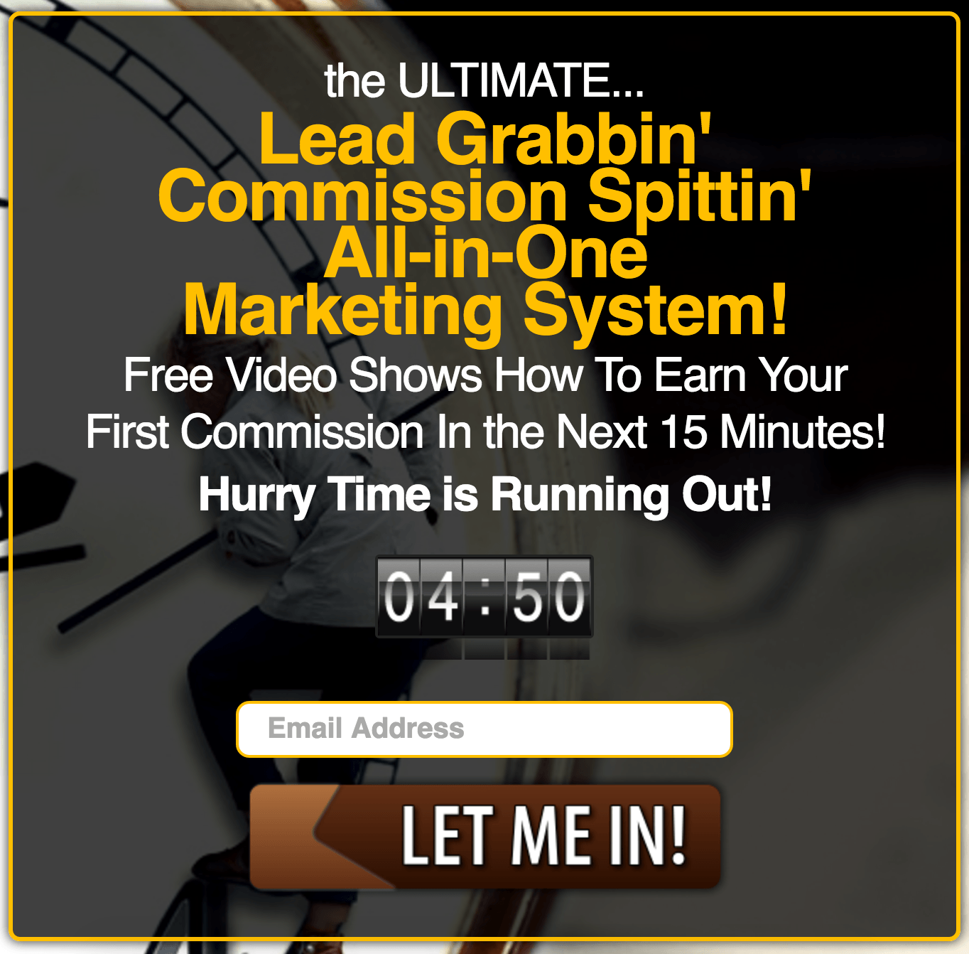
As much as I recommend you tap into the power of exclusivity and urgency, it’s not hard to go overboard with it.
These things work because they’re perceived to be real. As soon as anyone gets even an inkling that you’re messing them about, you’re done and they’ll never come back.
My recommendation is to keep your countdown timers real. If you have an upcoming webinar on Wednesday, have the countdown timer countdown to Wednesday. Promotion? Run it with a countdown until it closes. Webinar? Most GTW accounts genuinely do have a limit on how many people you’re able to host. Make that your stated limit.
And, it’s always possible to make it morE subtle, like Amy Porterfield does, with the “Reserve your Seat” CTA.
59. Price Decoy
Our choices are informed by their context. A good apple looks better next to a rotten one. An alright boyfriend looks heaven-sent after one who refused to leave the couch.
It’s the same for your lead generation offers.
Dan Ariely (behavioral psychologist and Ted speaker) did a study where he presented his students with a three subscription choices which looked like this:
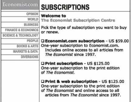
Ariely ran a study with 100 MIT students. 16 chose option A, 84 option C and 0 chose the Option B.
A cool idea for this would be to have two content upgrades promoted next to each other (but one with a bonus) which ask for the same lead information.
It’s possible that the contrast between the two would actually increase conversion rates of the one.
To learn more, check out ConversionXL’s article “Pricing Experiments You Might Not Know, But Can Learn From” or #10 within Chapter 6 of my Guide to Conversion Rate Optimization.
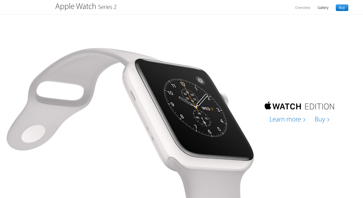
60. White Space
Modern website design is all about clarity – clean lines, white space and well-contrasted text.
And those things aren’t just about the artistry of web design. It’s not just because they look good. It’s also because it’s optimized.
White space (which doesn’t have to be white, by the way) focuses attention on everything that isn’t. It focuses attention on color, on text and, particularly, on contrast.
Here’s an example from Apple’s new Apple Watch Series 2:
To learn more, check out “Landing Pages: 5 Details that Make the Conversion Difference.”

Wishpond’s 1000+ Lead Generation
Strategies, Ideas, Best Practices & Examples
Click below to download the most comprehensive collection of lead generation strategies and examples ever compiled. Completely free.