Real Estate Lead Generation: 30 Strategies, Ideas & Examples
I’ve never met a real estate professional who doesn’t want more clients. You people are insatiable.
And yet your main strategy seems to be posters on the sides of buses or your face on the back of a bench.
Don’t be offended, but you’re behind the times.
This article will give you 15 strategies for lead generation and 15 strategies to improve conversion rates – it’s everything you need to understand and add to your website to get the prospective clients you want.
Let’s get rolling!
Strategies for Lead Generation
1. Content Upgrade
Content upgrades have, for many businesses, been one of the most impactful lead generation strategies of the past year.
Essentially, content upgrades are gated pieces of content which add value to your blog articles, news or reports. Every time you publish content to your site (including new properties) you’d place a call-to-action and link for a piece of downloadable content related to that content.
I’ll get into this a bit more in a second, but that link would open a “click popup” with a lead gen form, email-gating the downloadable content and requiring visitors to submit their lead information to access.
A few “content upgrade” recommendations:
- PDF Version of the Post: This is the simplest version of a content upgrade, in which you simply export your article as a PDF, upload it as a media file and gate access. Those readers who don’t have the time to read the full article now can download it and read it later or save it for reference.
- Checklist: Create a checklist of actionable steps your prospective clients need to take. For instance, create a checklist of “12 step checklist to prepare your home for viewing.” Add this piece of added value to an article about preparing your home for viewing.
- Audio Version: Record yourself (or a professional) reading your article or report. This allows your site visitors to download the audio content and listen to it at their leisure.
- More Information: Keep some of your valuable content or analysis back from your blog post, and make that information email-gated.
- Full Report: If you have access to original data (or even if you steal it from someone else) create a full report of that information. Here’s a walkthrough for how to do that.
Here’s an example of an in-line CTA for a gated report content upgrade:
Clicking the “Click here” link would either send visitors to a separate landing page for the report or open a “click popup” right within the tab where your prospective clients could download the guide once they’ve provided their lead information.
For more on click popups and how they can simplify and optimize your website, read on.
2. Use Click Popups Instead of Landing Pages for Content Upgrades
Throughout this article, you’ll see click popups triggered by an on-page button or link. This isn’t just best practice, it’s been proven to convert twice as well as sending your website visitors to a separate landing page.
Click popups keep your visitor on-page (any moving around adds friction and increases drop-off rates). They’re faster to load, more simple, and allow your visitors to get right back to what they were doing immediately.
Click popups can be triggered by any link – a word, a button, an image – and pop up right in the browser window. They’re usually multi-step, with a button, a second page, and a thank-you page, all embedded within the window.
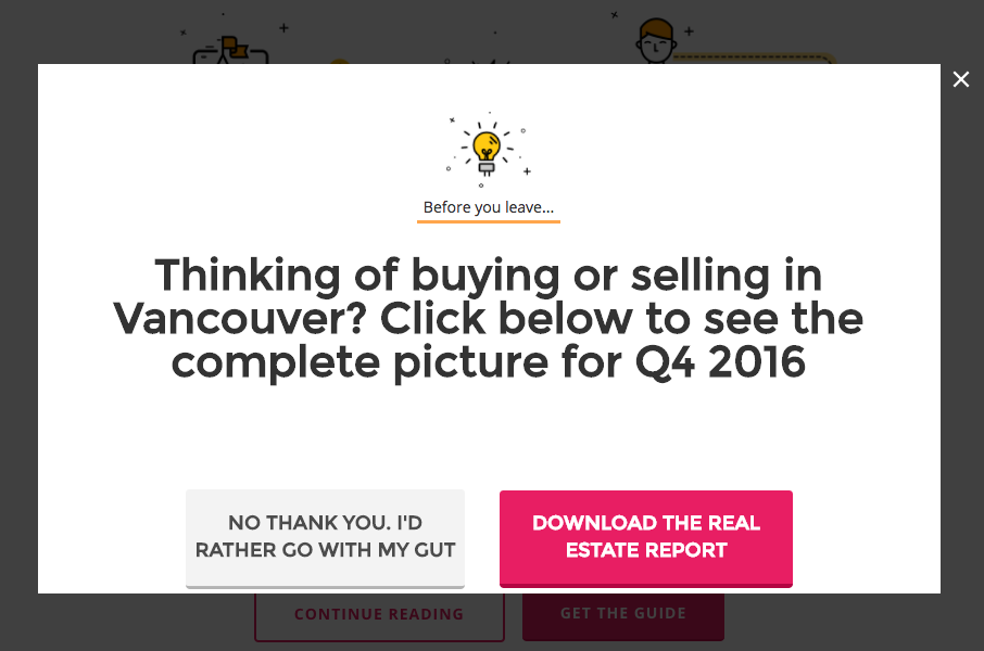
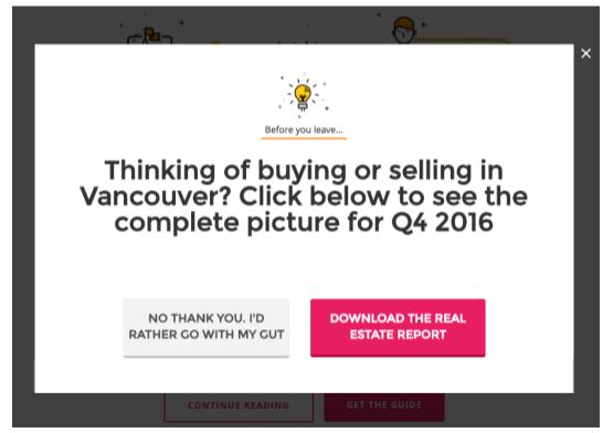
3. Exit Popup for Gated Content
Exit popups function as your last-ditch effort if the rest of your website’s lead generation strategies have failed. That doesn’t mean they’re not effective though.
Exit popups function by triggering when your website visitor’s cursor travels quickly toward the top of the screen or scrolls over the top pixel on the page. That’s why they’re often called “exit-intent” popups.
Often, and this is especially true if you use primarily landing pages and click popups, your website visitor hasn’t actually been straight-up asked for their email address. The opportunity has been there (on the sidebar, in-line, on a property page, etc) but they’ve never had to straight-up say no.
A lot of lead generation optimization is about encouraging your visitors to act. After all, not acting is substantially easier than acting. And many websites don’t actually require visitors to say “no.”
Popups prompt your visitors to say yes or no. There’s no other option. An exit popup promoting email-gated content is a great way to turn people considering leaving into leads.
Here’s an example:
4. Entry Overlay
There are a couple ways to use an entry overlay, but be aware that this is often reported as the most annoying lead generation tool out there. Entry overlays can be powerful, but they have to e used right.
Strategy #1: If you have a blog, set an overlay to appear recommending that your readers check out a comprehensive guide or resource before reading. It needs to appear like you’re doing them a favor.
Something like this:

Strategy #2: Some real estate websites prompt all visitors to create an account before accessing any of the information. This needs to be done delicately, but can be extremely effective.
My recommendation would be an overlay which says something like…
“We recommend you create an account before viewing AcmeRealty.com. An account will give you access to pricing reports, allow you to save and view properties, and more.”
And then two buttons, one which reads “Create an Account” and another which reads “Proceed without Account.”
5. Email-prompt for Access to Property Pages
You don’t want to entirely bar your website visitors from seeing the properties you’ve listed, but nor do you want to lose out on an opportunity for lead generation on your highest-traffic webpages.
My recommendation is to add an “email-prompt” popup which is triggered when your website visitors click on a property from your directory:
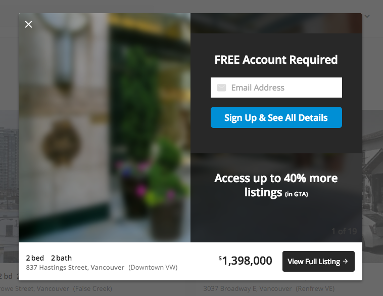
It might look like an account is required, but you can actually click through by clicking “View Full Listing.”
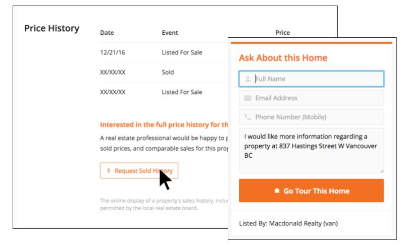
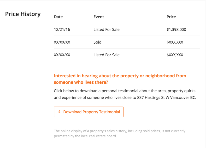
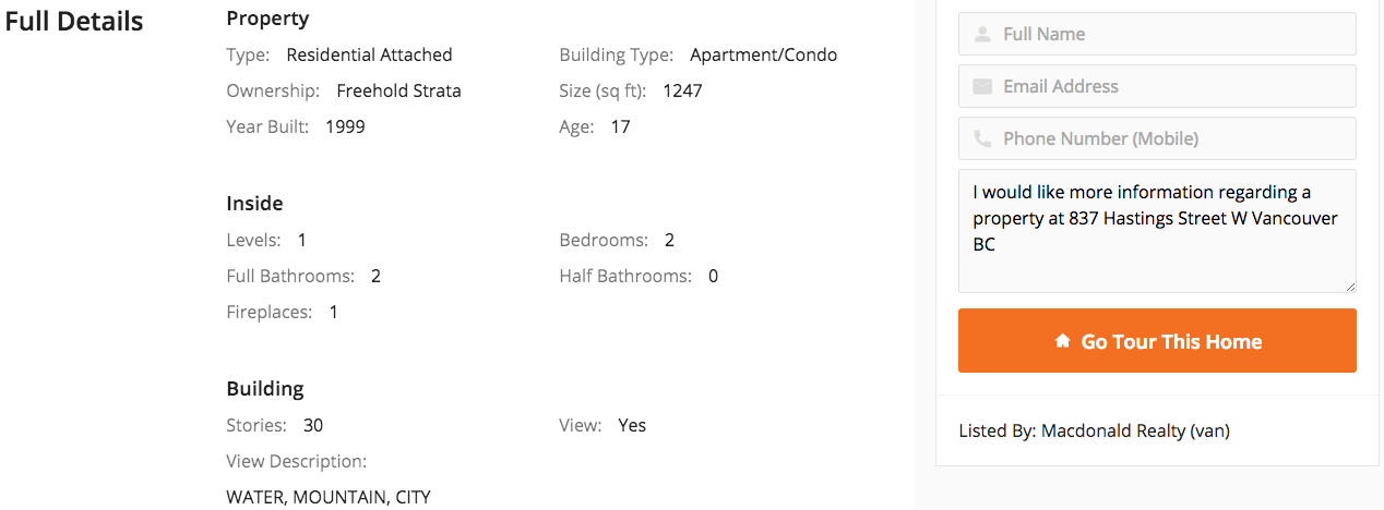
6. Property or Neighborhood History
This is the really valuable stuff – the stuff that your website visitors won’t get in the normal property breakdown.
But don’t worry, you don’t have to actually prepare a downloadable PDF of every property’s history or a complete guide to the neighborhood. Instead, have copy within your property landing page which reads, “Interested in learning more about the history of this home?” with an in-line button which sends the visitor’s browser window back up to the property’s form. Or, if you have a scrolling contact form (best practice), it could send the cursor to the top field of that form.
Here’s an example:
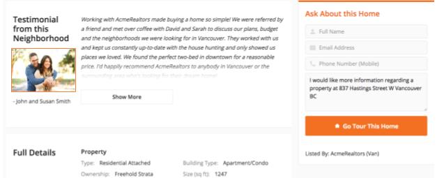
7. Previous owner or Neighbor Testimonial
This strategy is similar to the one above, but (arguably) even more valuable…
If possible, get information from a property’s previous owner or a next-door neighbor. Get quotes, things to be aware of, etc and create a PDF of this information. Email-gate the information.
This one might require a click popup and for you to actually create a PDF.
8. Access to the Property Images
If visitors haven’t yet created an account, when they arrive on the property landing page the images will be greyed out and an email-gate overlay will show.
Here’s an example:

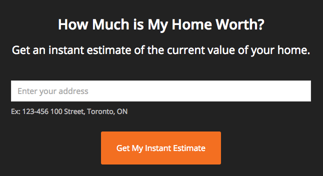
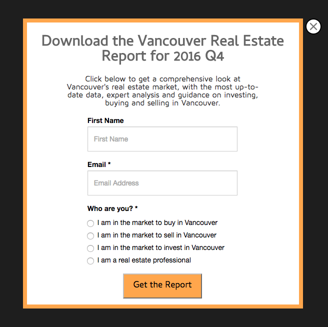
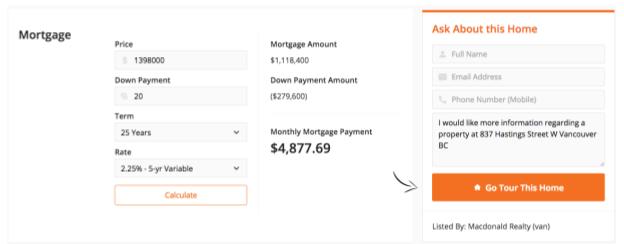
9. Free Tool, Valuation or Calculator
The most obvious tool for the real estate industry is a mortgage calculator. To turn your business’ calculator into a lead generation machine, my recommendation is to offer an approximate mortgage calculator completely free, but add an email-gate to a more comprehensive, advanced one.
People who are just interested in getting a general idea shouldn’t be barred from doing so. Often, gating your resources is about knowing when to do so as much as doing so, and you don’t want to frustrate people unnecessarily.
You can also do a home valuation estimate, and here (again) gate a more comprehensive valuation:
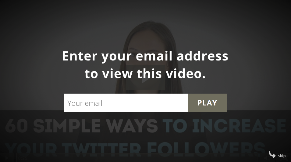
10. Home Walkthrough Video
If you’re putting together video walkthroughs of properties, use a tool like Wistia to add them to your website. For lead generation, Wistia also allows you to add an email-gate either at the beginning of your video, the end or (my personal favorite) about 30 seconds in.
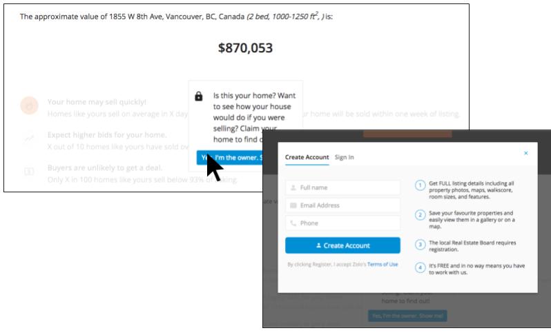
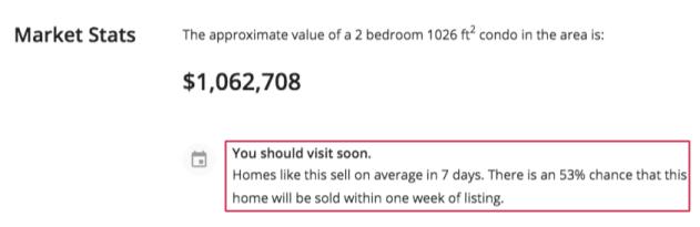
11. Specific Property Valuation
There’s a difference between a general property valuation (the free tool I mentioned above) and your property valuation.
The first is based on an approximate assessment based on old data. The second is based on a personal determination made by an expert with years of experience and knowledge of the current market.
So the second valuation is worth far more to your website visitor than the first.
Use that value to generate a lead. Here’s an example:
12. Source, Referral or Traffic-Specific Popup Offers
Depending on which lead generation tool you’ve gone with, you may be able to personalize your popups.
This can be anything, from recognizing a browser’s IP address to determine location (enabling you to show a popup reading “Check out properties in [visitor’s city]”) to recognizing them as a return visitor with an account (enabling you to show a popup reading “Hello John!”).
Here’s a couple examples of what’s possible:
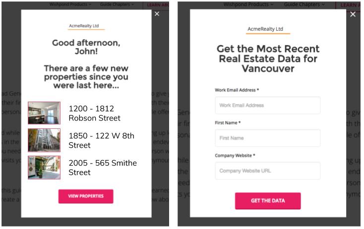
And if you don’t think that personalization like that will improve your business’ lead generation, you’re out of your mind.
Click here to view our complete guide to lead segmentation as well as see the most recent stats on the effect of personalization.
13. Personalize Lead Gen Pages Based on Visitor Activity
An expansion on the personalization you see above would be to personalize property pages based on the behavior and activity of your visitors or existing leads.
For instance, if a lead or prospective client has been viewing several property pages in a row, a super valuable (and very cool) way to personalize each page would be do the following:
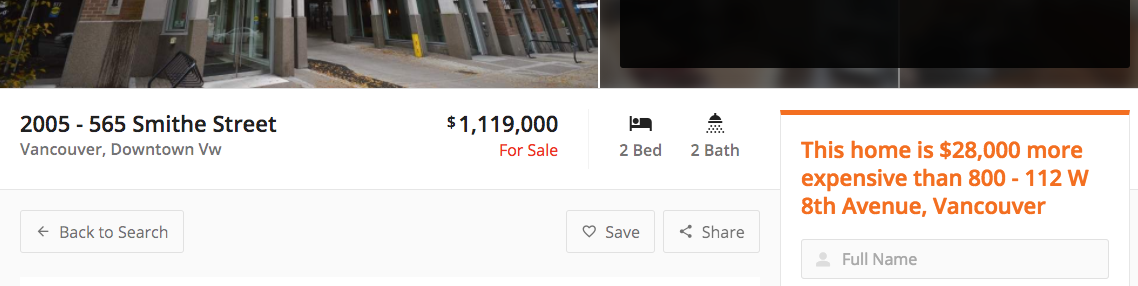
This isn’t so much a lead generation strategy (though it likely would improve conversion rates) it’s just really damn cool what’s possible.
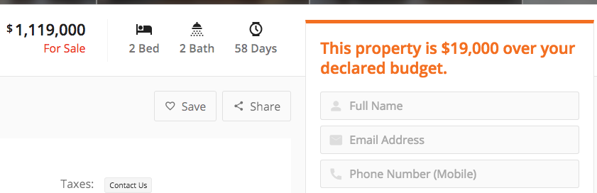
14. Personalize Lead Generation Pages Based on Visitor Information
Even cooler, in my opinion, is this next possibility…
Personalize the property page based on the visitor’s declared budget.
- Step 1: Add a couple buttons to your homepage, one for home buyers and one for home sellers.
- Step 2: Add an entry popup for first-time visitors who don’t arrive on your homepage.
- Step 3: Have the popup prompt visitors for their name and email address (not required) and their budget.
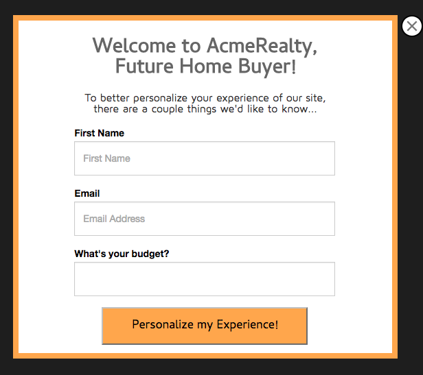
The information your visitors or leads enter will be added as “lead properties,” and enable your marketing automation platform to dynamically change your property pages to show if the property is below or above the visitor’s budget.
Like this:
Reach out to a Wishpond associate if you have questions about how to do this on your website.
15. Newsletter Subscription
You’re an expert in your industry, even if you’ve never written a word on the subject. You’ve been buying and selling, investing and talking with dozens or hundreds of people doing the same.
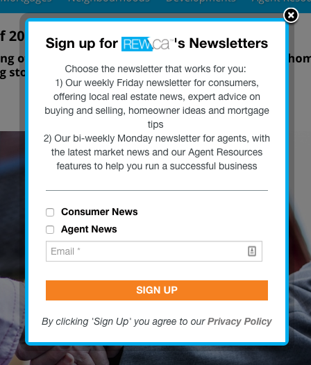
One of the best ways to generate leads for real estate is to create content which buyers, sellers and investors want to read.
Don’t think you have the time?
Consider that a single article on “Why Investing in a Condo is the Right Decision for your Young Family” can be written in a single afternoon and drive dozens of leads over the course of a year without you touching it once.
A few great article ideas to generate real estate leads:
- Is it Foolish to Buy Real Estate in [City] Right Now?
- Current Market Offers Great Opportunity to Move-Up Buyers
- Why Now is a Great time to Invest in a Condo
- Two Hot Investment Markets Outside of Metro [City]
- Now is the Best Time to Buy a [City] Home in Two Years
- How Can You Get Multiple Bids On Your Property?
- Townhouse Teardowns: What it Means, and What it Means for You
- How to Protect Your Home Sale from “Shadow Flipping”
- Infographic: Staging Your Home For Sale, Room by Room
For more strategies to drive leads in the real estate industry, check out our article “40 Real Estate Lead Generation Strategies.”
Ideas to Improve Lead Generation
16. Urgency
Previously, I mentioned that exit popups are so powerful because they require your website visitors to say yes or no. The reason they’re so impactful is because people are lazy.
It’s substantially easier for a website visitor (even if they’re aggressively looking to buy or sell a home) to do nothing at all. Visiting a realtors website feels like progress. They can visit, poke around a little, and then leave feeling like they’ve accomplished something today.
So you need to prod them a bit, and urgency is one of the best ways to do that.
There are, in most marketing situations, a few ways to add urgency to your campaigns:
- Limited time: “This sale ends Friday!”
- Limited availability: “Only 2 seats at this price left!”
In real estate lead generation, the main factor we want to tap into is limitation on time.
Here’s an example:
Increasing urgency on campaign pages has shown to improve conversion rates by more than 147%.
17. People Will See Through Fake Urgency Tactics
This is especially true in the real estate industry. Normally I’d recommend that you add countdown timers to your campaign or promotion pages, but with a property, there’s no legitimate reason to count down to anything.
Pretending there is, is the quickest way to lose the trust of your website visitors.
The last thing you want to do is to make them believe they’re being scammed or, almost as bad, sold to.
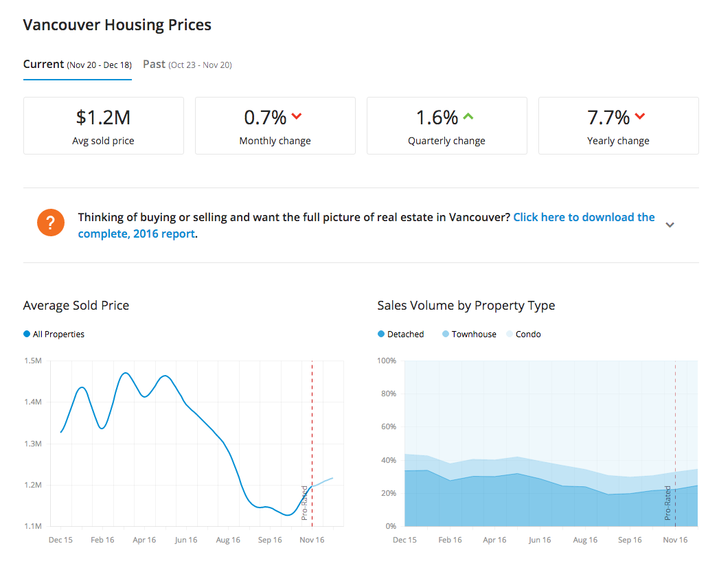
18. Segment Upon Generation
If you’re creating real estate content (like a report on the real estate market in Vancouver) you’re going to generate different qualities of lead.
And one of the biggest wasters of your budget is trying to sell to people who have no interest in buying or, worse yet, trying to sell to other real estate professionals.
This is why segmentation is so important.
Let me give you an example of an essential part of real estate lead generation:
Your lead generation platform (whether it’s Wishpond or any other tool) should send you an email when you receive a new lead.
You can either respond and reach out to each of your leads manually (though that will get less scalable and more difficult as you start implementing these lead generation strategies and generating more leads).
Or, and this is my recommendation, start adding your leads to segments, or lists, and sending them automated email drip campaigns with properties they might be interested, guides to buying or selling, and other educational content they might be interested in.
Here are a couple resources for the real estate industry centered on lead nurturing:
- A walkthrough to creating email campaigns for the real estate industry.
- If you want a more general guide, here’s a walkthrough for creating an online sales funnel, specifically for the real estate industry.
19. High-Contrast CTAs
I’m sure you’re already doing this, but I want to reiterate its importance nonetheless.
If your website visitors can’t find your call-to-action button, they’re not going to click on them. And, given that your CTAs are the things which actually turn a visitor into a lead, hiding them is about the stupidest thing you can do.
High-contrast is essential. Color, size, font color, whatever it takes. Make your CTA buttons visible from a mile away.
Just don’t go overboard. Nobody needs a neon green CTA button on an orange property landing page.
Here’s an example (orange works well on white):
20. Challenge Popup Viewers Decision to Leave
Clicking no is instinctual. You don’t even think about it. Only when all the conditions are perfect do you even pause for a second.
But what if exiting, what if no, felt wrong?
A powerful lead generation strategy is to challenge your popup viewer’s decision to click “No” with some negative copy.
Something like this…
When WhichTestWon (now Behave) added a challenge to their business’ popups, they saw an email submittal increase of 27.25%.
And your business can do the same. Consider adding a “challenge” on your popup’s exit buttons to make viewers think twice before instinctively opting out.
21. Have Multiples of the Same CTA
Many property pages are long. You’re giving a lot of information, and you can’t just squish it together in a massive paragraph.
So your visitors scroll past your lead generation form – which is above the fold, as it should be – get to the bottom of the page and bounce (leave the page without converting or clicking on anything).
Unless, of course, you have a high contrast, attention-grabbing button at the bottom of the page which sends visitors back up to the form at the top.
You can either use a landing page provider to make this happen, or try your hand at using Javascript.
22. Use Images of People Help Visitors Visualize Working With You
Don’t get me wrong, the focus of your website and property pages should be the properties. I’m not telling you to replace that beautiful kitchen shot with a random smiling model.
What I’m telling you, instead, is to get creative. Images of smiling people have shown to double landing page conversion rates.
Here’s an example from a software company, but the best practice holds true in every industry:
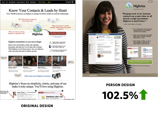
And here’s how a real estate business could bring a smiling face into their next property page:
23. Add a Progress Bar in Popups
If you have a two-step popup, an optimization tip for the second page is to feature a progress bar.
Not only does this tell prospective leads how much more work they have to do, it’s also a psychological tool. Once someone’s started something and made progress on it, they’re far more likely to complete the activity than if they haven’t yet made progress.
Here’s an example from a marketing website:
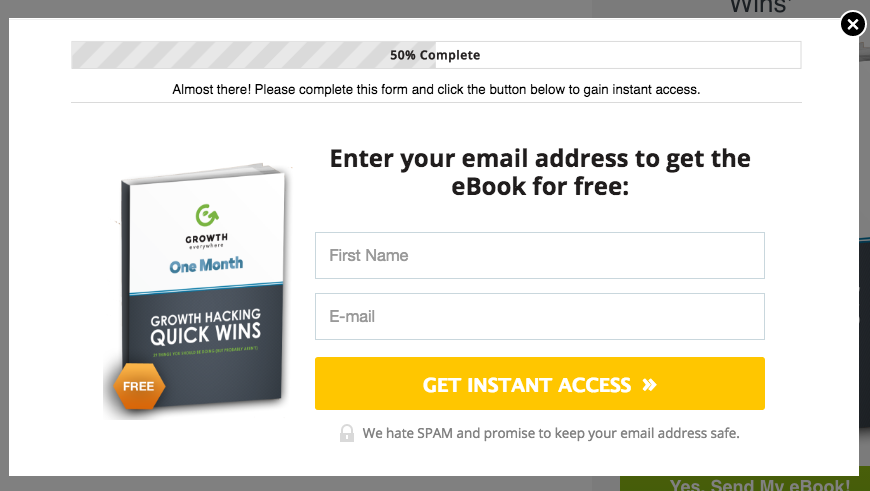
There’s no reason why your gated content popup or contact form would be any different.
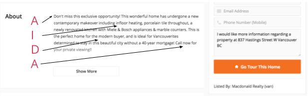
24. Use the AIDA framework
There are a few formulas for copywriting on your property pages. The next few points will cover some of the most popular and most impactful.
The most popular and well-known copywriting formula is AIDA:
Attention– Grab your visitor’s attention
Interest– Keep their attention by offering something they haven’t seen before or something interesting
Desire– Engage their desires, their heart, on an emotional level.
Action– Prompt an action or conversion
An example of this for real estate:
25. BGNGo Bullets Formulas
This strategy (from the queen of copywriting, Joanna Weibe) is particularly of relevance to real estate marketers, and relates to the order of your lists.
She recommends you structure them like this:
- Best point
- Good point
- Necessary, average point
- Good, with Outcome
Essentially she’s talking about how your page visitors read the details about your available properties. In her experience (and this makes common sense, as well) people read the first few points of a list, skip a bit, and then read the last one. She recommends you “bookend” your benefit list with two of your most appealing selling points and fill the middle with your not-so-appealing, but necessary, elements.
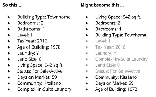
26. Make your Copy Palatable
Avoid paragraphs. They’re hard to read, hard to see the value in, and make a clean property landing page look cluttered and overwhelming.
Your website visitors aren’t here to read a novel. They’re here to be given the vital information about a property – the things which will sell them on becoming a lead or booking a showing.
It’s likely that you have a map or neighborhood breakdown on your website. Why do you do that?
It’s to help your visitors navigate to the areas and information they want quickly and efficiently.
Imagine if, instead, your website just listed all the properties available in paragraph format. One after another with addresses, prices, mortgage calculations, square footage and everything else in one big paragraph.
It’d be insane, and nobody would ever contact you.
Your property pages are the same. As much as possible you need to break information up into palatable, easily-seen and easily understood bullet points and organized into sections.
27. White Space
I’m as guilty of making this error as anyone.
Every single time I design a promotion or campaign landing page, I hand it over to a designer for a final check. I’m not terrible at design but, without fail, their immediate feedback is “needs more whitespace, James.”
So what is whitespace, and why does it matter so damn much?
Here’s an example which might help clear things up. Below is the same information side by side, on the left that information has whitespace. On the right, less-so:
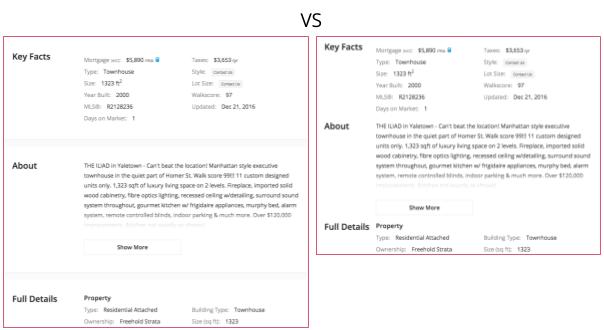
My designers tell me it’s about ensuring your elements aren’t “constrained,” “tight,” or “busy.” They tell me that whitespace draws your attention to the elements you want focused upon.
Like an entree at an expensive restaurant: massive white plate, tiny piece of fish.
I don’t really care about that. I care that, time and time again, pages with whitespace convert better than pages without.
We’re bottom-line people, after all.
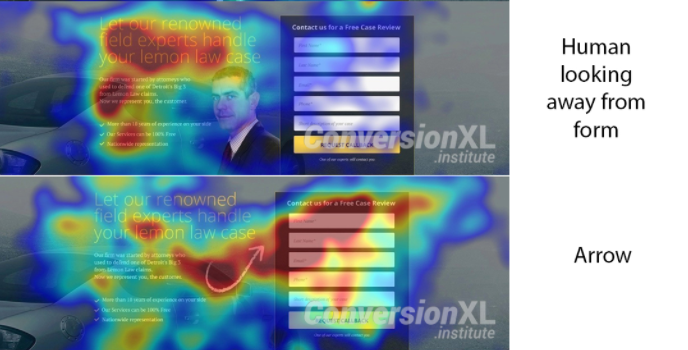
28. Use Visual Directional Cues
This strategy is one of those things you probably think won’t actually affect your business’ lead generation campaigns. I mean, seriously? Adding an arrow which scrolls as your lead gen form does? Who’s really missing this thing?
And yet, time after time, businesses find that visual directional cues (arrows, chevrons, lines within formatting, even eye direction on models) increase the time a visitor spends looking at a desired element as well as how long it takes them to do so.
Here’s an eye-tracking “heatmap” which shows what I’m talking about. Red shows where people were focusing on this page. The top example is a model looking away from the form, and the bottom example is an arrow pointing towards the form:
Worth a try?
Here’s a simple real estate example:
29. “Apply to be one of us”
This is a formula for your CTAs, but it’s also a strategy in and of itself.
“Apply to be one of our members” communicates exclusivity. And this is something you want all over your website.
Remember that club, lunch table or group you wanted to be in when you were 9, but they wouldn’t let you join? Or remember being in that club, and how cool it felt to be part of something exclusive?
The power of that emotion doesn’t go away. People are still motivated by it, subconsciously, when making consumer decisions.
The new iPhone is desirable not just because it’s cutting-edge, but because owning it is exclusive (at least for the first week or so).
How to Use this Formula:
- When prompting your website visitors to subscribe to your newsletter, use the messaging “Get Access,” “Join the AcmeRealty Club,” or “Apply to Join.”
- In your auto-response email as soon as people join, emphasize the exclusivity of the mailing list. Write “You’re in!” at the top of the email, or even “You’ve been given access!”
- Frame your newsletters like you’re talking to members. Refer to them by a label in the salutation – “Members of the AcmeRealty Club,”
30. Don’t try to be too clever
You might be more familiar with this strategy as “Keep-it-Simple-Stupid,” or KISS.
This is when you pay way too much attention to this article and start spending all your time A/B testing your website and none of your time emailing prospective customers or on the phone.
Don’t get me wrong, everything in this article is powerful. I wouldn’t have written it otherwise.
But we have a rule in landing page optimization, and it applies to online marketing in general: The fewer distractions you offer your visitor, the higher your conversion rate.
Keep your website simple, clean, and clear:
- Make your CTAs obvious.
- Add more whitespace than you think you should.
- Add website popups, but a maximum of one per page. Make them easy to quit.
- Make navigation through your site simple and obvious.
- Once you’ve added analytics and are converting well, stop and focus on driving traffic. Once you’re driving traffic and conversions are dropping, switch. This is a healthy pattern to get in.