![]()
50-Part Framework for Big Lead Generation on your Website
Table of Contents
- Source-Exclusive Entry Offer
- Welcome them with a personalized headline to make them feel special
- Use the logo of the source to make them immediately recognize and relate you to the site they came from that they trust
- Scroll Bar
- Use a bright color that contrasts with the rest of the page
- Urgency Factor (Limited Time, etc.)
- Giveaway
- One tactic to create more urgency is to show the total prize value in the scroll bar.
- Live Webinar
- Early-Bird/Limited Time Discount
- Don’t add a countdown timer, it makes it annoying to read the article
- Allow to close/hide to give more room to read the article
- Slide-in Popup
- Slide-in Popup
- Offer Related Content
- Tell them that it’s the next best thing to read
- Use a slide-in animation
- Provide social proof by showing how many people have downloaded your offer
- Show in a highlighted box to make it standout
- Use the same font as the rest of the article to make it look like a part of the article
- If there is a lot of text in your content upgrade — only make the CTA part of the text look like a link, so that it stands out and breaks up the text
- Place a content upgrade CTA in several places throughout your content
- Top-of-page Content Upgrade
- PDF of article
- Spoken Word Audio Version of article
- Tell that the article is incredibly long and to download it to save for later
- Inline Content Upgrade
- Blueprint/workflow for a specific strategy
- Worksheet
- Templates
- Checklist to implement specific strategy
- Tools to implement strategies
- ‘Definitive Guide’ to one specific strategy in a list post
- The P.S. Formula
- Bottom Content Upgrade
- Bonus Strategies
- ‘Hidden’ Image
- Click Popup (for Content Upgrades)
- Utilize the Ziegranik Effect by adding a 50% progress bar
- Re-state the offer in the headline
- Ask for Email-only
- Exit Intent Popup
- Use a Big Number to stop them in their tracks
- Use 2-button opt-in
- Use Big Bright Buttons
- Give positive reinforcement after they click ‘Yes’ above the form on the second step
- How to do something big
- A Quick Win aka discounts or promotions
- Want to [achieve goal] without [pain]?
- [Unlock]/[Are you in?]
- Do you want [Free % Discount]
1. Source-Exclusive Entry Offer
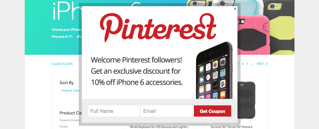
By targeting specific source links from places like social media or guest posts, you can offer source-exclusive offers. Depending on where the traffic to your website is coming from you can have exclusive offers for specific groups.
When that source specific audience arrives a popup can show and present the exclusive deal you’re offering.
In the example below, users coming from Pinterest get special access to 10% off iPhone accessories.
Exclusivity and personalization is a great way to speak directly to your audience for a higher chance of conversion.
See examples under #15 – https://blog.gleam.io/25-growth-hacks/
2. Welcome them with a personalized headline to make them feel special
Personalization can have a large impact on your landing page conversion rate.
One way to add more personalization to your landing page efforts is to include a personalized headline according to the source of the traffic.
Guest posting or syndicating on another website and directing traffic back to your website with outbound links is a perfect opportunity to add some personalization.
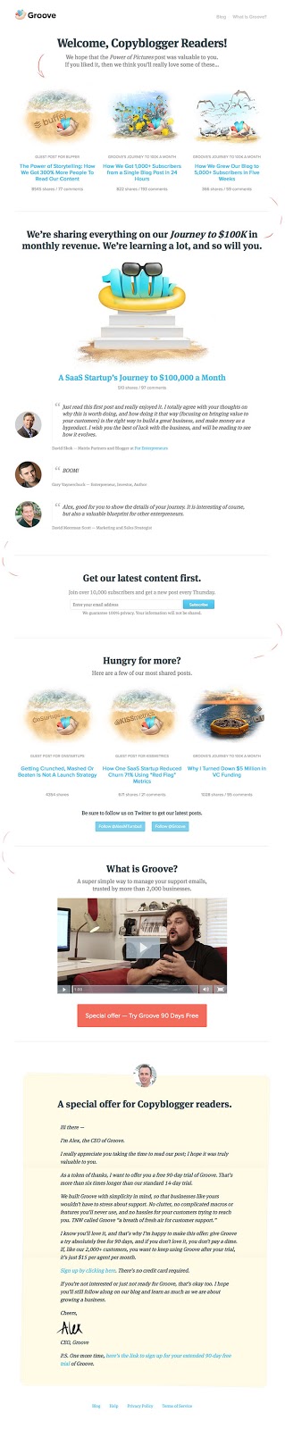
Groove, everyone’s favourite helpdesk software, makes sure to add a bit of personalization to all their guest posting efforts.
When Groove contributed to the CopyBlogger blog they had all of their outbound links direct to a source-exclusive landing page for CopyBlogger readers. Note the source specific headline and the exclusive offer for CopyBlogger readers at the bottom.
3. Use the logo of the source to make them immediately recognize and relate you to the site they came from that they trust
Along with a source-exclusive headline, when you are creating a source specific landing page or popup including the logo of the source will make it easier to identify.
Pictures speak louder than words they always say so grab a copy of the source logo and add it alongside your own logo to show your affiliation. It’s a little addition that has immediate impact for visitors looking for some familiarity on your website.
4. Scroll Bar
A scroll bar is a CTA bar that is stuck to the top of a website that scrolls with you while you browse. It typically is used for promoting a limited time offer or a new piece of content on a website.
Scroll bars work well because they’re affixed to the top of the screen and stay with the visitor wherever they scroll. Their bright colours and urgent communication make scroll bars one of the most effective places to for a CTA. According to industry data, a typical scroll bar should average a conversion rate of 1 – 2%.
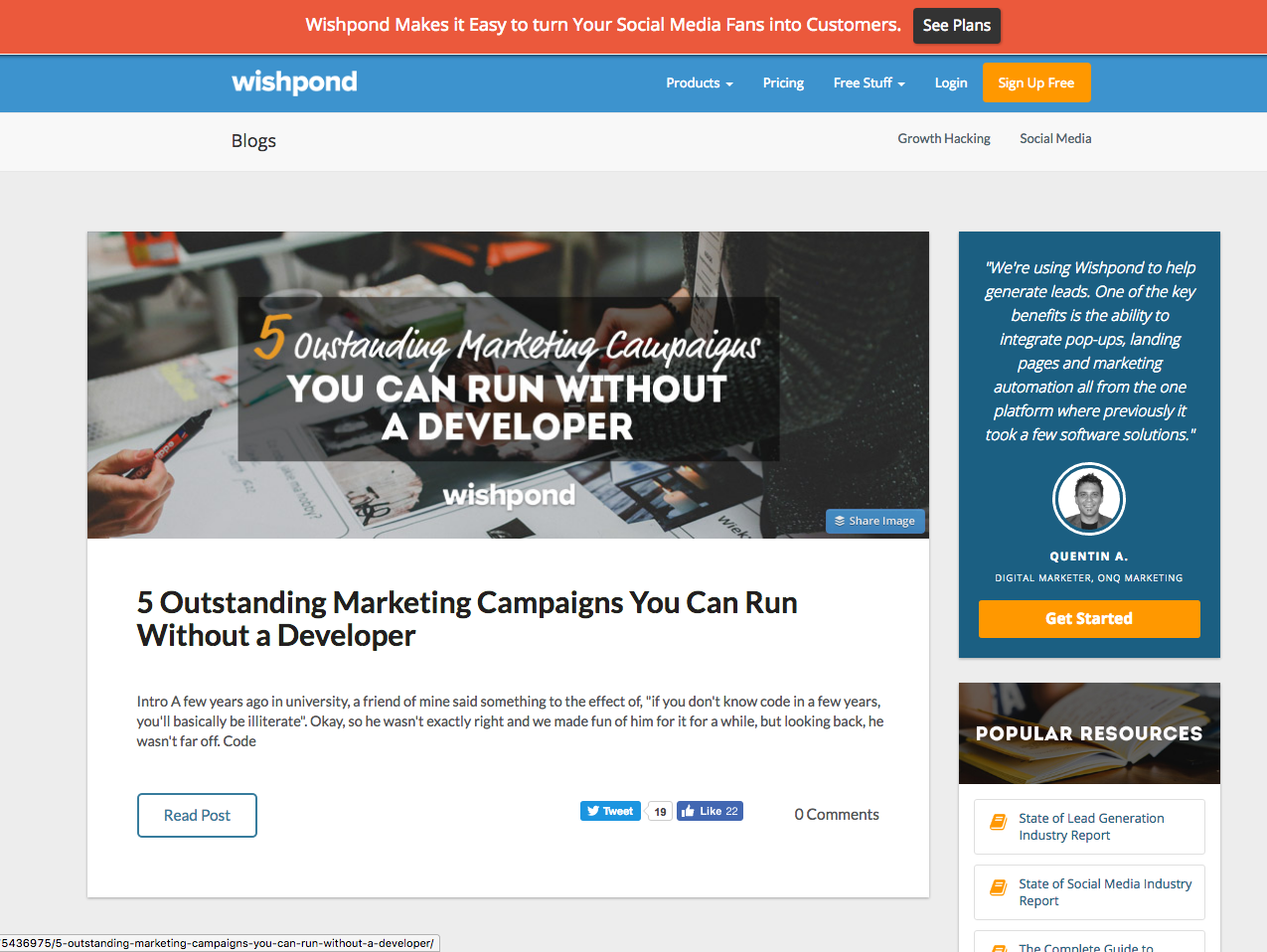
Whenever Wishpond releases a new promotion, tool, or piece of content we make sure to add a scroll bar CTA to alert all of our blog readers.
5. Use a bright color that contrasts with the rest of the page
When designing your scroll bar choose a colour that contrasts with the rest of your webpage so that it stands out as much as possible.
A scroll bar should be designed to grab as much attention as possible so choose a bright colour that promotes excitement.
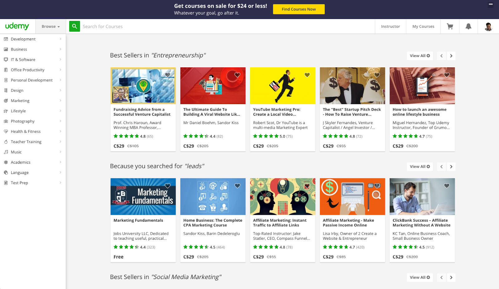
Udemy, the online education marketplace, uses their scroll bar to promote their courses that are on sale. The language and bright purple/yellow colour all promote urgency and scarcity.
6. Urgency Factor (Limited Time, etc.)
Promoting a new or limited time offer?
A scroll bar is the tool for the job. Creating a sense of urgency fits when within a scroll bar because it sticks to the screen of all your visitors.
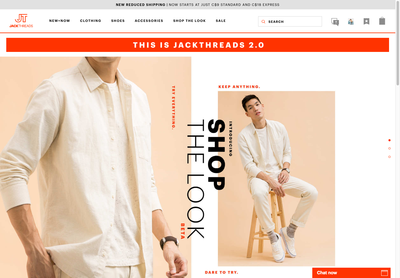
JackThreads uses their scroll bar to alert all of their visitors of new reduced shipping. The alert makes sure all visitors know that shipping costs have changed and that it’s time to take advantage of it.
Best Offers for Scroll Bar
The best offers for the Scroll Bar are Limited-time offers. The scroll bar will be the first thing to be seen and read, as it’s at the top of the page, but it’s not what the visitor originally came to the page for, so you’ll need to create a LOT of urgency and excitement to generate clicks.
7. Giveaway
A fun and engaging giveaway contest fits right into the strengths of a scroll bar.
All the visitors to your website will be shown the scroll bar and a giveaway is a great way to capture more lead information. The right prize for your target audience is a surefire way to grab the attention of all your visitors.
8. One tactic to create more urgency is to show the total prize value in the scroll bar.
The length of the giveaway and the total prize value are all elements that add to the urgency of the scroll bar.
9. Live Webinar
Promoting a live webinar to generate leads?
Live webinars are one of the highest value offers you can offer your target audience. Your audience can get a live demo, for example, and get a great sense of the value you can provide.
Use a scroll bar to alert all of your website visitors that registration for your exclusive webinar is taking place.
If visitors landed on your website’s blog looking for social media advice for example, a webinar on “Creating Social Media Visuals for Beginners” promoted in the scroll bar is a logical next step for them to continue experiencing what your business has to offer.
10. Early-Bird/Limited Time Discount
Are you promoting a new product, conference, event or service?
Make an early-bird/limited time discount offer in a scroll bar to grab the attention of all your visitors.
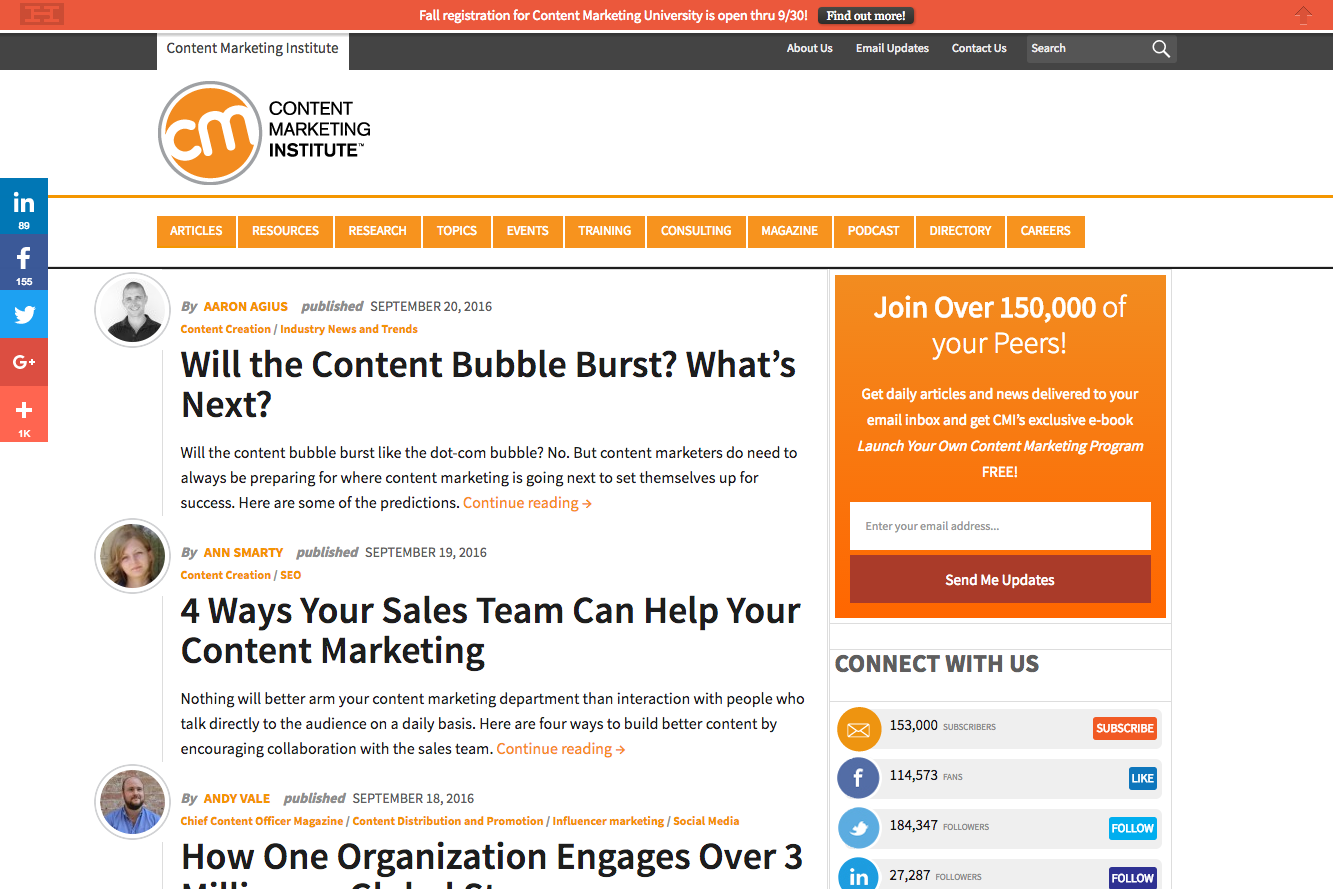
ContentMarketingInstitute used their scroll bar to let all their visitors know that fall registration for Content Marketing University was open. Adding the specific registration date and actionable CTA added much more urgency to the mix.
11. Don’t add a countdown timer, it makes it annoying to read the article
Creating a sense of urgency with your scroll bar is important but avoid using a countdown timer for the simple fact that it’s distracting.
A countdown timer that is constantly counting down will take away from the user experience and distract those reading your content.
12. Allow to close/hide to give more room to read the article
If you’re employing a scroll bar to promote something make sure to include a button to close or hide it to give your users more screen real estate. Not doing so might decrease your website’s user friendliness and increase the amount of visitors bouncing.
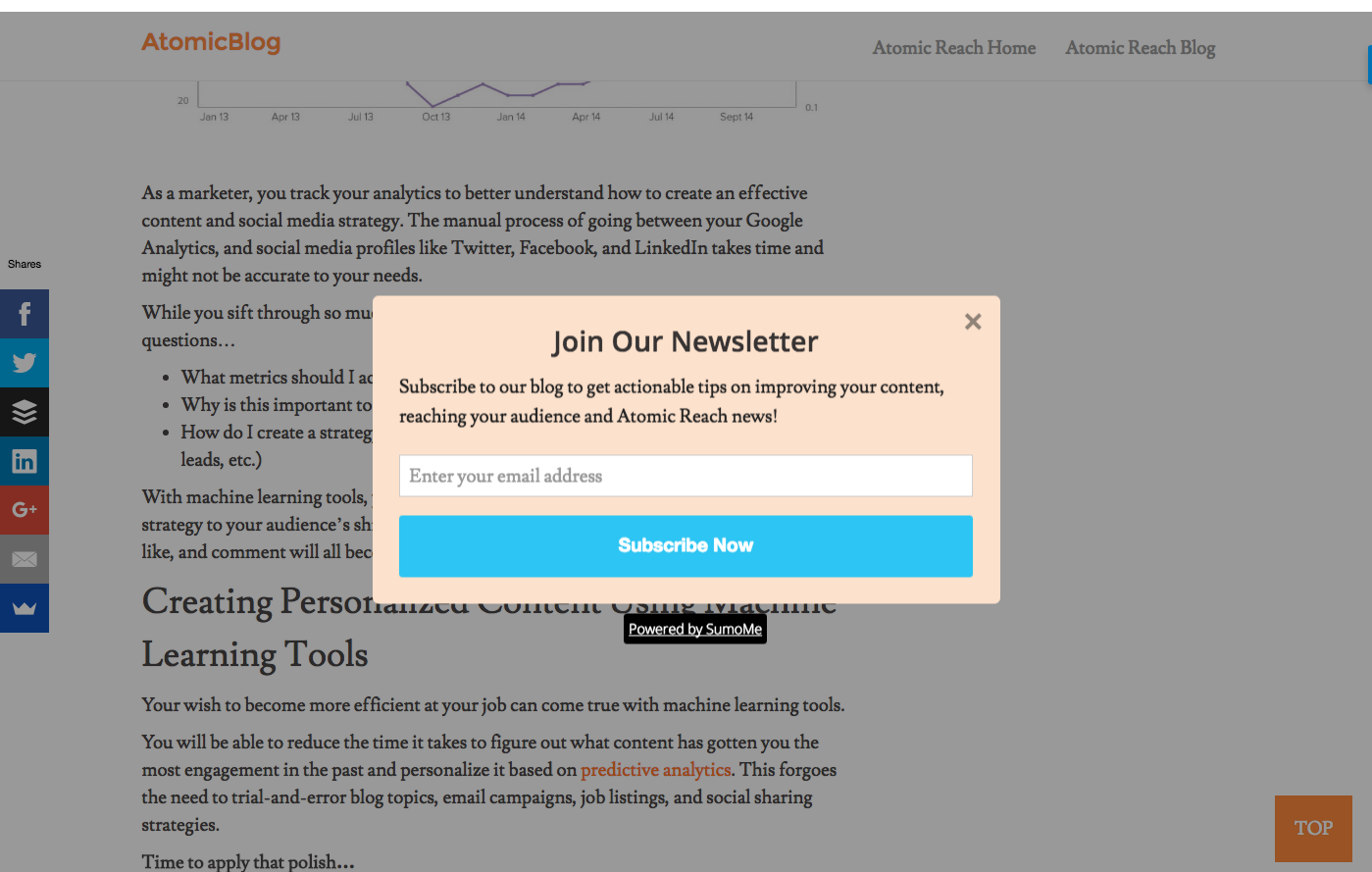
13. Slide-in Popup
A slide-in popup is a variation of the traditional website popup. Instead of covering the entire screen like a website popup, a slide-in popup “slides-in” from the side of the website. It is deemed a less intrusive way to present an offer and grab a visitor’s attention.
14. Offer Related Content
Like an overlay-style popup, a slide-in popup is a great way to present an offer without interrupting your visitor’s reading experience.
Slide-in popups are great for offering related content to your readers. Research has shown that conversion rates are higher on offers that are highly relevant to the content readers are viewing.
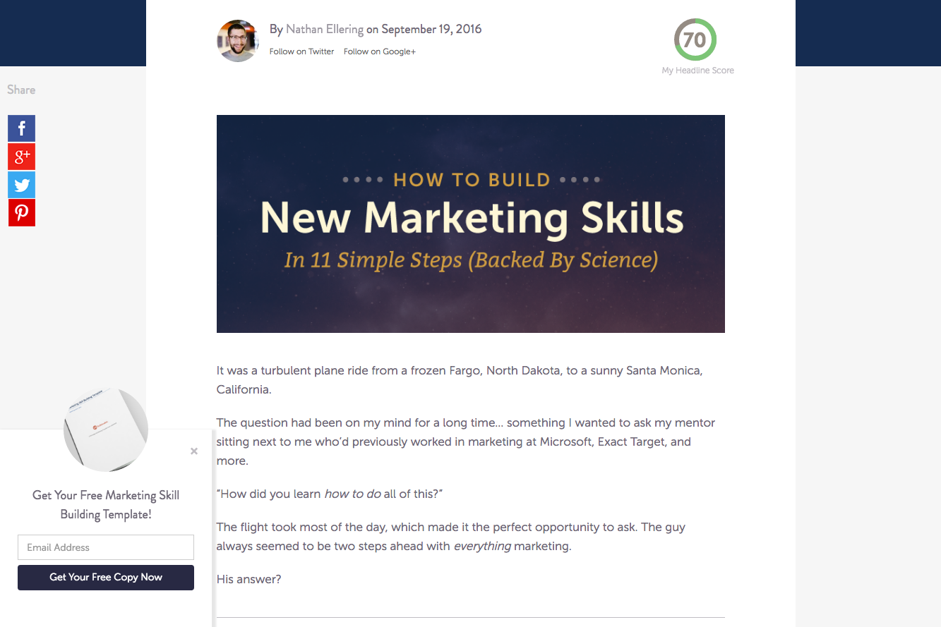
CoSchedule, makers of every marketer’s favourite headline tester, uses a slide-in popup to offer their free marketing skill building template on a blog post about new marketing skills. High relevancy makes their slide-in popup that much more enticing.
15. Tell them that it’s the next best thing to read
Slide-in popups don’t always have to have an offer. Slide-in popups can be used as a navigation tool to suggest relevant content.
Instead of just leaving your website you can use a slide-in popup to direct readers to a content piece that is maybe further down your conversion funnel such as a case study. Once they make their way down your blog post it would help to suggest the next steps to avoid bouncing.
16. Use a slide-in animation
One of the defining features of a popup is that it can be displayed in a number of animated ways. From dropping down to sliding in, a slide-in popup is no different.
Experiment with different slide-in animations for your popup to see what grabs the most attention. A small wiggle animation or a fade-in may perform better than a traditional slide animation.
17. Provide social proof by showing how many people have downloaded your offer
There is a reason why products on Amazon with stellar reviews sell better than products that don’t: social proof.
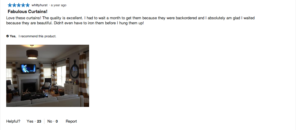
If you’re offering a free ebook to your visitors for example, showing the number of downloads it has received is a great way to show social proof that your ebook has value.
Word of mouth or in the digital sense, online reviews, is still rated as one of the most effective and highest converting marketing channels. It adds credibility to the brand and gives visitors enough confidence to convert.
Content Upgrades
A content upgrade is an inline call-to-action that offers a bonus piece of content in exchange for lead information like an email address.
Don’t use a form, instead, have it open a click popup with a form or what marketers call a two step opt-in. Instead of having a passive email opt-in embedded inline in one of your blog posts for example, a two step opt-in would require users to click on a link then fill in their email.
This works better than a one step opt-in because it requires the user to initiate the process, signaling a much higher intent. Once they click to subscribe to your email they are much more likely to complete the opt-in process and provide their email.
According to OptinMonster, 2-step optins have been shown to improve conversion rates by 785% compared to passive opt-in forms.
For Top-of-page and Inline Content Upgrades
18. Show in a highlighted box to make it standout
To draw more attention to your content upgrade put it in a highlighted box or encapsulate it in a different background colour.
Besides drawing attention with a different background colour, an encapsulated content upgrade can help break up long pieces of content for your readers.
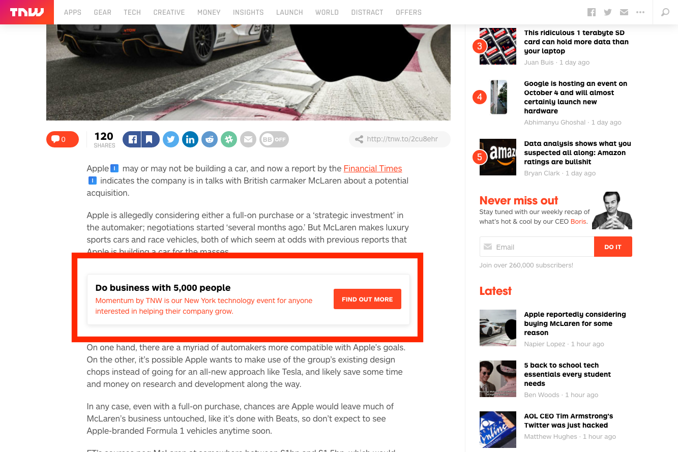
TheNextWeb places an inline CTA for its conference in an encapsulated box to get the attention of its readers. Something like a small drop shadow and a bright colour is enough to break up text and capture some attention.
19. Use the same font as the rest of the article to make it look like a part of the article
If you’re referencing your new ebook in your article use the same font and text colour.
Inline CTAs are shown to be the most effective form of lead generation because you’re able to set up or prime your reader to click on a link.
If you’re writing on social media lead generation tactics for the fitness industry for example, you might have a blog post listing 5 key strategies and in the middle of it reference your new ebook.
Something like this:
If you liked reading these tips you might enjoy my new ebook here.
20. If there is a lot of text in your content upgrade — only make the CTA part of the text look like a link, so that it stands out and breaks up the text
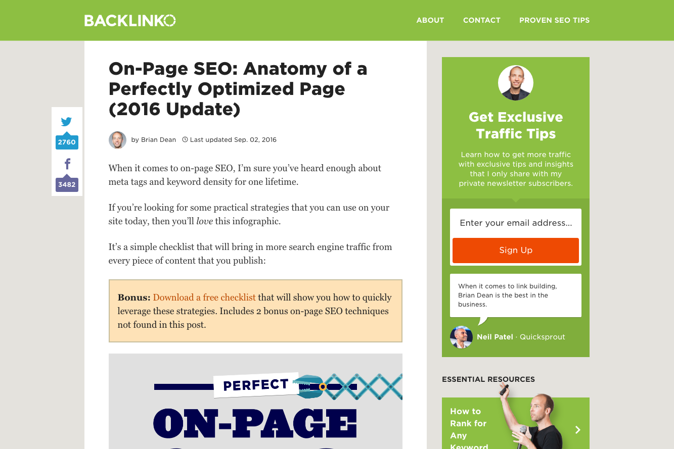
To avoid using a massive piece of anchor link in your content, only link the content upgrade to the CTA part of the text like Brian Dean does for Backlinko.
It looks far more pleasant on the page and far less spammy for your readers.
21. Place a content upgrade CTA in several places throughout your content
Throughout your content make sure to place more than one CTA after each chunk of content to remind your reader that an offer exists. Besides helping to break up the content for your readers, there will be points at which they’ll decide to click on your CTA after they’ve read some of your content.
Make sure that there’s a CTA for them to click as they make their way through your content.
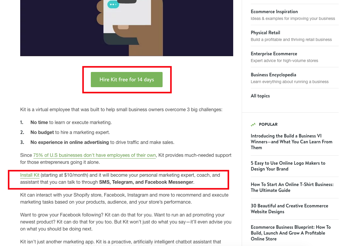
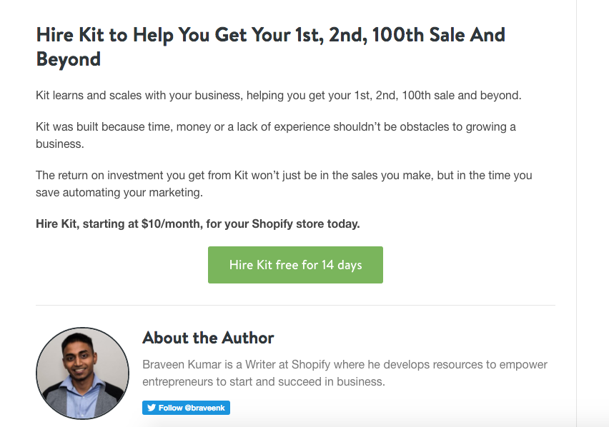
Shopify knows this and places CTAs throughout their blog piece on their new AI assistant bot Kit. They’ve placed encapsulated CTAs and inline CTAs throughout the piece so that when their reader decides to give Kit a try, there’s a CTA for them to click.
Having only one at the beginning is a massive missed opportunity for a conversion. Help out your readers by placing your offer throughout your content so they don’t have to go searching for it.
22. Top-of-page Content Upgrade
If you’ve created a long piece of written content it’s the perfect opportunity to offer a content upgrade.
“Download this post as a pdf” is a typical content upgrade most marketers offer for their readers so that they may save your post to read later. Brian Dean of Backlinko is a big fan of this technique.
At the end of your introduction, after you’ve hooked your reader, kindly offer a content upgrade to download the post as a pdf. You receive a lead and your reader receives your content to read at their leisure.
Best Content Upgrade Offers
23. PDF of article
Offer up a full pdf copy of your article for you users for easy offline reading.
24. Spoken Word Audio Version of article
Read out your article and offer up the audio file for easy listening while your readers are on the go.
25. Tell that the article is incredibly long and to download it to save for later
Have a hefty worded piece of content? Let your readers know that they can download it and read it at their own pace, offline and at their leisure.
26. Inline Content Upgrade
Inline content upgrades are meant to present an offer that is directly related to the piece of content your user is reading.
An article breaking down strategies about growing your Twitter following can mention a downloadable checklist for your readers to keep handy.
An article about landing page conversion rate strategy could offer free html landing page templates for download.
Inline content upgrades are proven to be effective because they’re directly related to the topic at hand.
Best Offers
27. Blueprint/workflow for a specific strategy
Are you writing about specific strategies or workflows for your audience?
Offer a free blueprint/workflow for that specific strategy that will help them start in the best position.
28. Worksheet
Are you educating or teaching your audience something in your wheelhouse of expertise?
Offer a free worksheet that will help them practice and prepare.
29. Templates
Are you teaching your audience something that is a bit more technical in nature? A bit of code perhaps or a technical series of drip emails.
A free template to start from is a great content upgrade that will help them start off properly.
30. Checklist to implement specific strategy
Are you showing your audience a specific and rather long strategy?
Checklists make great content upgrades to make sure your audience is following your steps in the correct order. A checklist for all the most effective landing page elements for example makes a handy resource for those building their first landing page.
31. Tools to implement strategies
Do the strategies you’re advising your audience to use require specific tools to implement?
Giveaway that tool or a comprehensive list of possible tools your audience can use as a content upgrade.
32. ‘Definitive Guide’ to one specific strategy in a list post
Have a long list post filled with multiple strategies and tactics?
Create the ‘Definitive Guide’ for one of the specific strategies and offer it up in an inline CTA.
EnchantingMarketing offered their ebook on writing to seduce buyers and offered it in their post in their post on copywriting formulas.
33. The P.S. Formula
The P.S. formula is the tactic of leaving a tiny reminder at the end of your article for your reader. It simply serves as a way to remind your readers of a related offer once they’ve finished reading your article.
Take a look at this example from Hubspot:

34. Bottom Content Upgrade
Another effective placement for your content upgrades are at the bottom of your articles. Once readers have finished reading they’ll have arrived at the bottom of your article and it’s up to you to recommend a next step for them to complete. That’s where the bottom content upgrade comes in.
Best Offers
35. Bonus Strategies
Save one or two strategies from a list post to offer as bonus strategies for a content upgrade. Readers can then provide their information to unlock the bonus content.
36. ‘Hidden’ Image
An unlockable or hidden piece of content like an infographic, at the end of an article makes a great content upgrade. With a simple dark overlay or a small blur you can offer a bonus image to your readers.
Take a look at how Backlinko does it with their bonus image content upgrades:
37. Click Popup (for Content Upgrades)
A click popup is a manually triggered popup that displays after a specific user action, such as clicking on an inline link.
At Wishpond we’ve found that using click popups, instead of sending to a landing page resulted in a 60% increase in opt-ins.
38. Utilize the Ziegranik Effect by adding a 50% progress bar
The Ziegarnik Effect refers to the fact that people are more likely to complete a task once they’ve started it.
Capitalize on this effect by adding a progress bar at the top of your popup that starts at 50% once a user clicks and actives a popup. The progress bar will show that half of the task has already been completed thus they are more likely to complete the task and opt-in.
39. Re-state the offer in the headline
Remember to restate what you’re offering in the headline to avoid any confusion for your users. If there is any ounce of doubt in their head preventing them from converting a strong headline that restates the offer will minimize it.
40. Ask for Email-only
According to FormStack the number of fields a form directly correlates to a drop off in form completion. The more form fields you have, in other words, the less likely users are to complete it. Unless your offer is the greatest lead magnet your users have ever come across it’s best to keep your click popup form only asking for email.
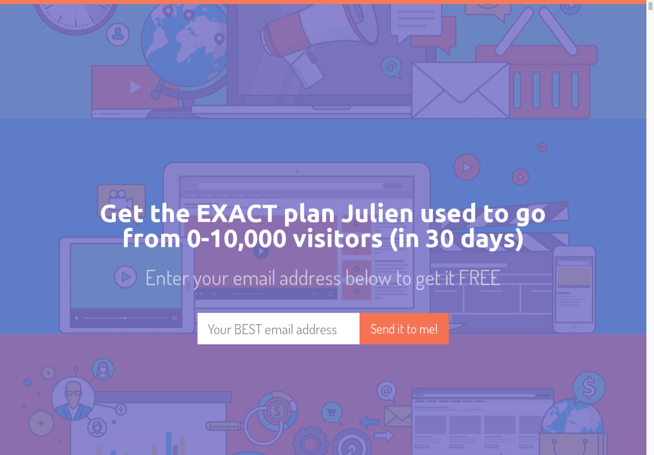
41. Exit Intent Popup
An exit intent popup is one that presents itself as a user moves to close a browser window and leave the webpage. It’s a tool meant to present an offer as a last ditch effort to save a visitor as a lead or complete a checkout process.
42. Use a Big Number to stop them in their tracks
Using a big number in your offer can be a big attention grabber and stop your users in their tracks.
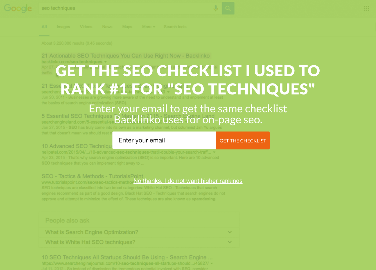
SumoMe uses a big number in their exit popup to pitch the exact plan to go from 0-10,000 visitors in 30 days. They use a big number to reinforce their credibility and to grab the attention of users who are about to leave.
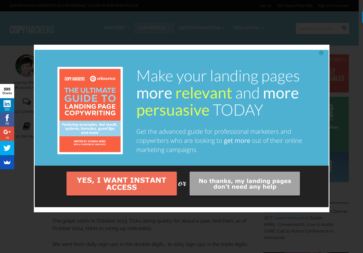
43. Use 2-button opt-in
2-button opt-ins force users to make a decision. Whether that be to accept your offer or to deny it, they need to make a choice.
Joanna Wiebe of CopyHackers explains that, “When a visitor is presented with an opt-in form, it’s so often the case that said opt-in form has just one button, and that button is there to be clicked if you choose to opt in. If you choose not to opt in, you do not have to click a button to state your preference; you simply X out, click out or otherwise ignore the opt-in button. Most of our opt-ins are active and opt-outs are passive.”
Instead of a passive opt-in form floated inconspicuously on the sidebar of your website a 2-button opt-in presents users with a choice and more importantly, a consequence.
Below is CopyHacker’s 2-button opt-in that first offers their landing page guide. Once users click ‘yes’ they’ll have already begun the process of signing up or on the other hand clicking ‘no’ and choosing to reject the offer. Either way a decision must be made.
44. Use Big Bright Buttons
The bigger and brighter your exit popup buttons are the more attention they’ll draw. For people about to leave your website a big and bright button will be the first thing they’ll see and stop to consider.
People are in the process of leaving and are in the worst state of mind to take any action you want them to. To alleviate this, make your ‘Yes’ button so big and bright that they immediately notice it
45. Give positive reinforcement after they click ‘Yes’ above the form on the second step
Aside from big and bright buttons to grab attention, positive reinforcement is a great way to get users to continue onto the next step.
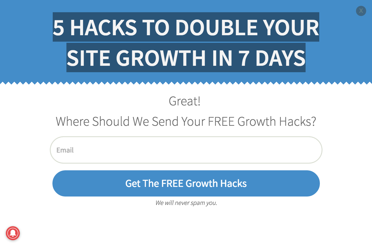
Take a look at this example from the AuthorityHacker exit popup:
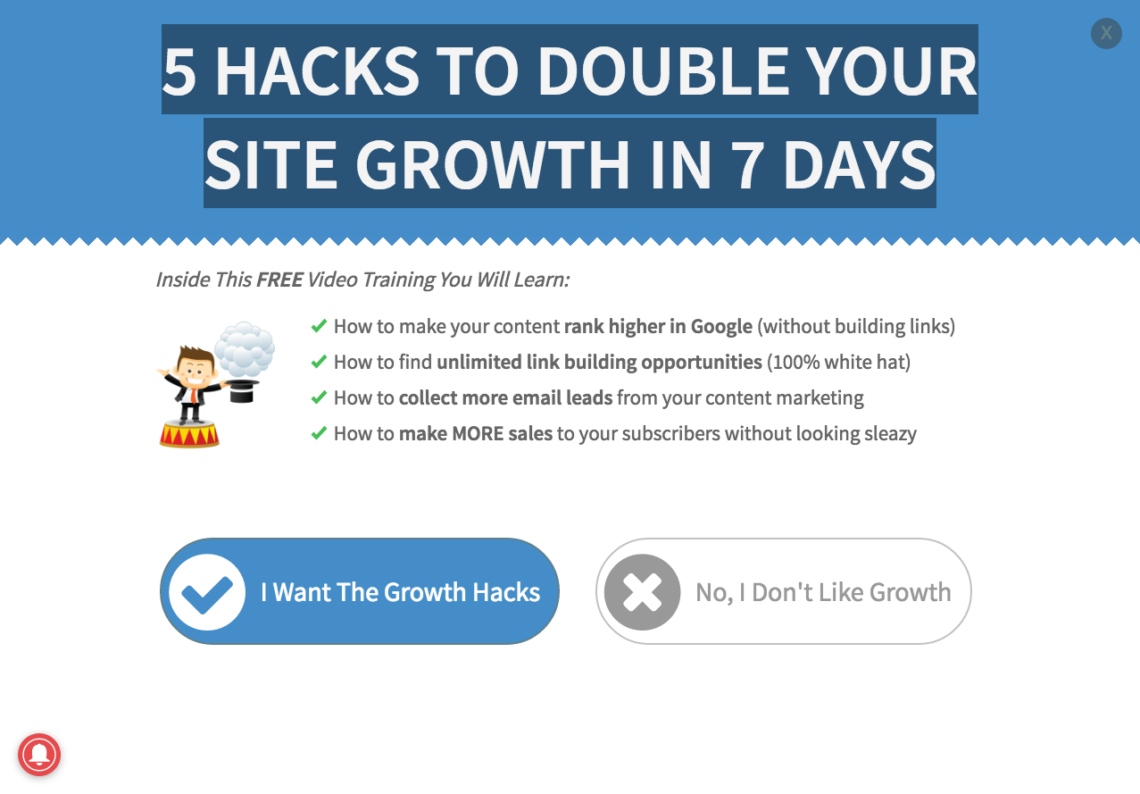
Once they’ve clicked that they want the growth hacks they’re shown some positive reinforcement at the top:
Best Offers
46. How to do something big
Like the SumoMe example above, a big number or offer is the most likely way to grab the attention of a person about to leave.
Big secrets and ideas have big impact.
47. A Quick Win aka discounts or promotions
Ultimately the most effective way to get people to reconsider leaving your website is with a small discount or promotion to get them to stay.
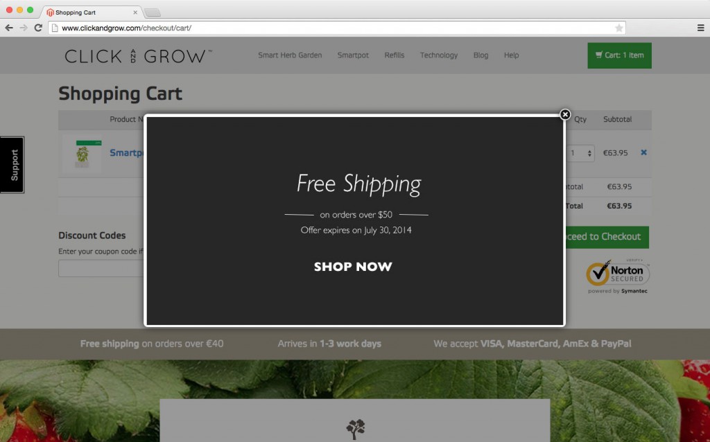
ClickandGrow uses the angle of free shipping to increase sales and interest in their products.
Best Headline Formulas
48. Want to [achieve goal] without [pain]?
Headlines work best when they speak directly to the target audience. Touch on a pain and offer a solution to that pain.
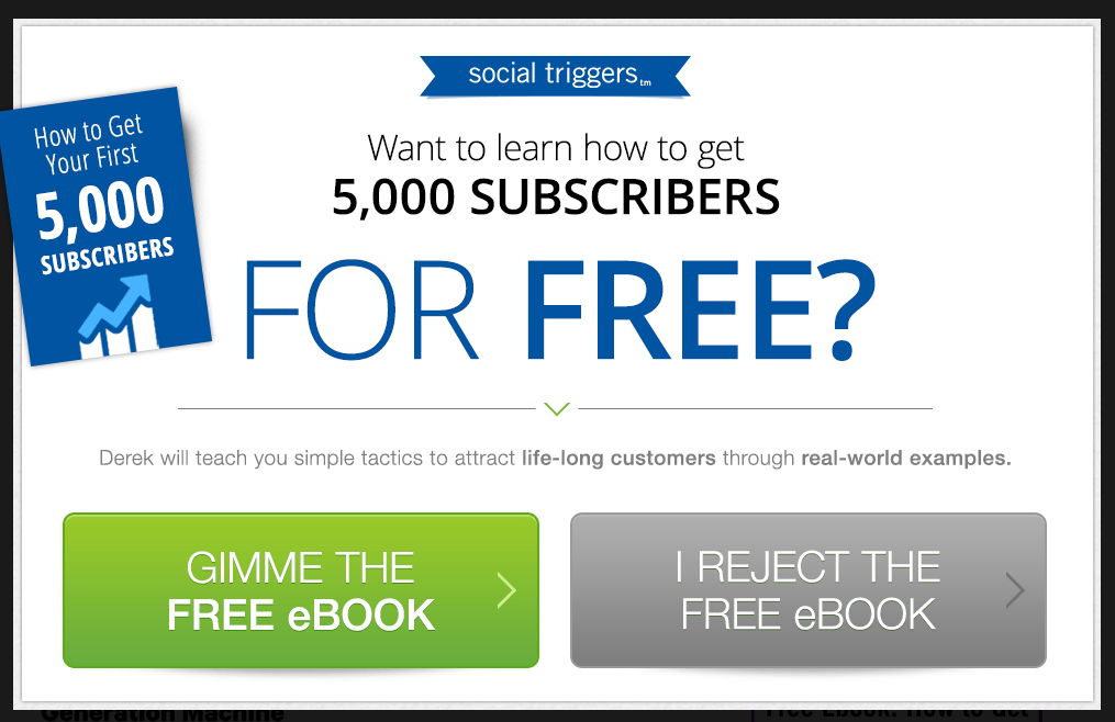
SocialTriggers touches on the wish to gain more subscribers for one’s blog and offers a free ebook to solve the problem. Their exit popup uses the 2-button opt-in to make people decide between gaining 5,000 subscribers or not.
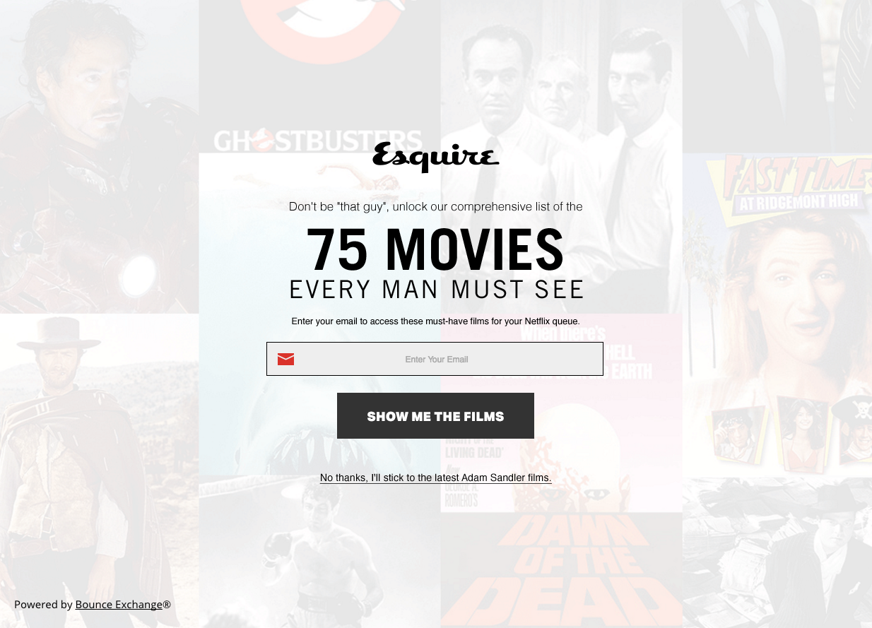
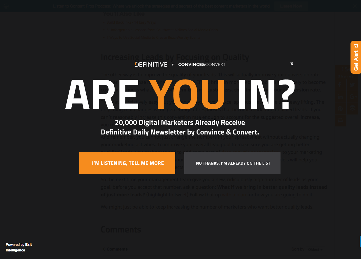
49. [Unlock]/[Are you in?]
Creating the essence of exclusivity is a powerful way to entice visitors to subscribe or opt-in.
Esquire uses this exit popup to capture leads by offer a list of 75 movies every man must see. They use the word ‘unlock’ to create that air of exclusivity and scarcity. Simply by entering your email you’ll unlock an exclusive resource.
Convince&Convert uses the exclusivity of their email list to attract more subscribers. Join 20,000 other digital marketers in an exclusive group, just by entering your email.
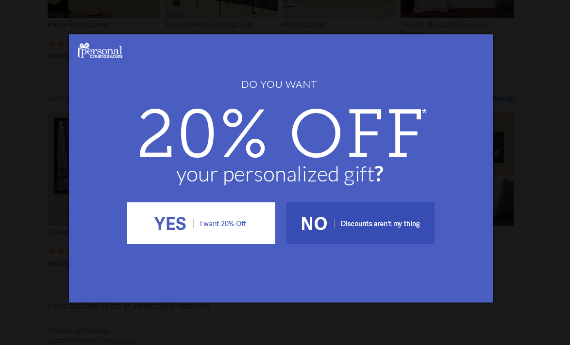
50. Do you want [Free % Discount]
Making a direct pitch to your audience can increase the likelihood of them claiming that offer. This exit popup by PersonalCreations offers 20% off to their first time visitors to improve sales and retain new customers.

Wishpond’s 1000+ Lead Generation
Strategies, Ideas, Best Practices & Examples
Click below to download the most comprehensive collection of lead generation strategies and examples ever compiled. Completely free.