Lead Generation Forms: 50 Strategies, Ideas & Best Practices
Strategies & Ideas
- Use CAPTCHA fields to block spammer robots
- Checkboxes require less brainpower than open-ended fields
- Use watermark text to hint at formatting
- Make your form fields BIG
- The less form fields the better
- Visual Form Options
- Utilize Arrows as directional cues
- Break up long forms into multiple pages
- Formstack’s 2015 Form Conversion Report
- Use a Progress Bar for multi-page forms
- Use a ‘wiggle’ button to draw attention to your form
- Form Encapsulation
- Match field and button alignment and length
- Don’t encapsulate your fields and not your button
- The impacts of colour — Red means error (and bad feelings ensue)
- Replace Dropdown menus
- Tell the user what to do in each form field, instead of just labelling each with what you want them to enter in
- Match Form Headline to Button Label Text
- Add benefit to button label
- Use an Action word on your Button Label
- Submit Button Conversion Metrics
- Words to Encourage Community/Sense of wanting to belong (on Button)
- Don’t bring up ‘Spam’
- Yes, Placement above-the-fold matters
- Avoid ambiguous button titles
- Technical Form Tips
- Focus on first form field
- Dynamically replace text based on AdWords Keyword
- Real-time Line Field Validation
- Add Anchor Links to Forms in long landing pages
- In Click-Popup (click link to see)
- Thinkific
- ConversionXL
- Exit Popup: Social Media Examiner
- Aweber
- Digital Marketer
- Bottom of page: Falcon.io
- Click Popup: Amy Porterfield
- deltaDNA
- Social Bakers
- Mulesoft
- Percolate
- Vision Critical
- Exit Popup: Magnet4Blogging
- Four Hour Work Week
- Zebra
- Entry/Timed Popup on Curation Suite
- Wordstream
- Microsoft Office
- ClickFunnels
- SmartPassiveIncome
Form Design Tips
1. Use CAPTCHA fields to block spammer robots
To prevent loads of web crawlers and robots from inundating your website with spam messages, a CAPTCHA (Completely Automated Public Test to tell Computers and Humans Apart) tool generates test fields that only human users can pass before the form is submitted.
Spam (not the wonderful mystery meat product) prevents the irritating comment spam that can also have negative effects on your SEO by pointing outbound links to poor quality websites.
A CAPTCHA does add an extra task for your visitors to perform in the form so weigh the risks and benefits of using a CAPTCHA. But if you’re being bombarded by comment spam, consider using a CAPTCHA to prevent it.
2. Checkboxes require less brainpower than open-ended fields
Instead of using open ended form fields that require open ended answers, consider using checkboxes. Think back to middle school exams, multiple choice questions always required less effort.
If you already have a specific set of answers you’d like your visitors to provide, checkboxes will get the job done faster and more efficiently.
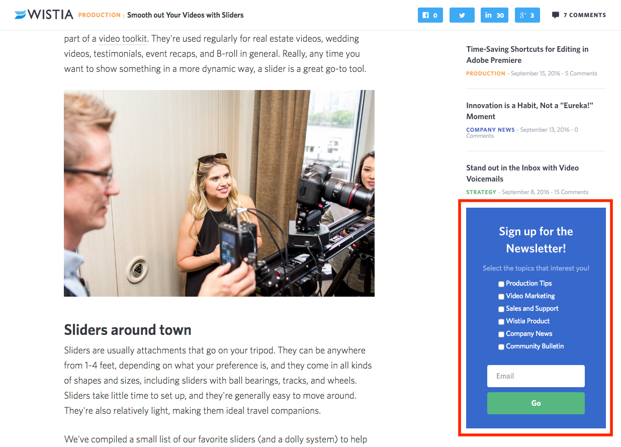
To subscribe to Wistia’s newsletter you can easily check-off the content you’d like to receive from them. Instead of asking their users in an open ended form field what their interests are, the checkboxes simplifies the process. This way Wistia can receive consistent form submissions and segment their subscribers easily.
3. Use watermark text to hint at formatting
Have a specific format you’d like your visitors to use when submitting their information?
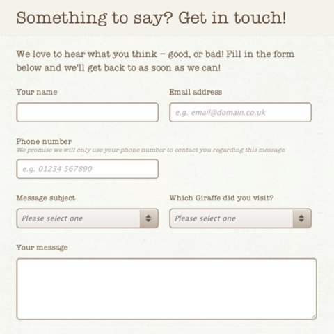
Pre-fill your form fields with examples to give them a hint at how you’d like it formatted. This way it’ll be easier to segment the information and organize the submissions.
Like the phone number field in the example below, you can enter in an example for your visitor to follow.
4. Make your form fields BIG
According to Formstack’s 2015 Form Conversion Report, more than 50% of forms are filled out on a mobile device. And one of the biggest reasons for drop-off on mobile devices is the inability to easily select something with your finger on the touchscreen.
The more friction your form has the less likely your visitor is to complete it. Make life easier for them by increasing the size of your mobile form fields so that they can easily be selected on a touch screen.
5. The less form fields the better
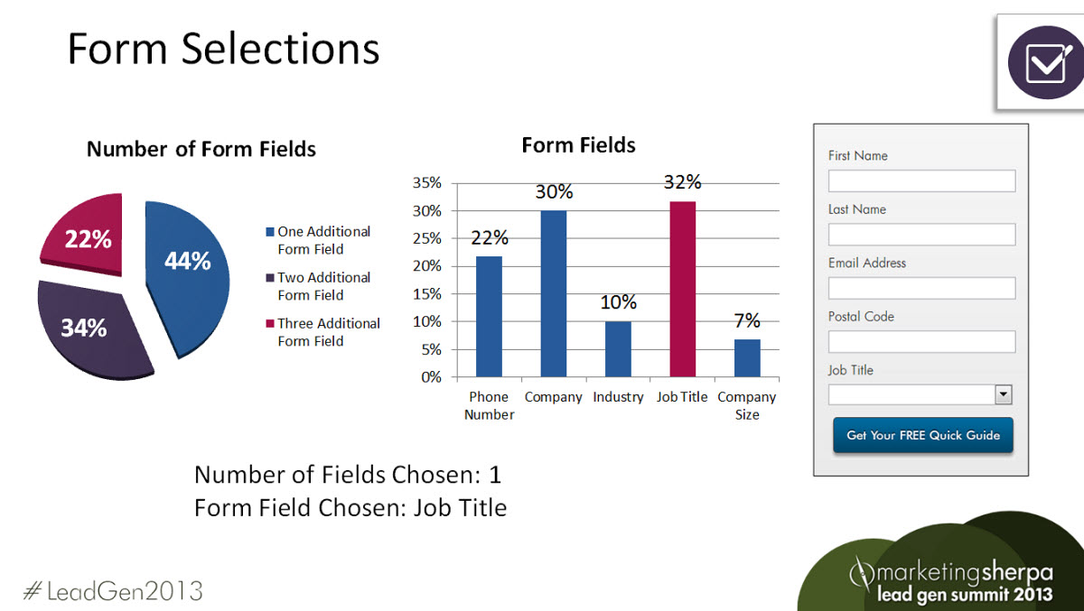
According to a study by MarketingSherpa more form fields only result in less conversions. One of their forms for the Lead Gen Summit received 11% fewer conversions when they added one more form field.
Think about only asking for the absolute necessary information on your first interaction with a new visitor. Unless your lead magnet is the most impeccable offer they’ve ever seen, additional form fields will only decrease the amount of conversions you receive. Further down the road, in the middle of your sales funnel once you’ve developed a stronger relationship, you may ask for more information to make a sale.
6. Visual Form Options:
You know the old saying, a picture paints a thousand words. Using visual cues on your forms will help your visitors absorb information quicker and more efficiently. Our brains are built to process images much faster than words, case in point, road signs that use symbols instead of words.
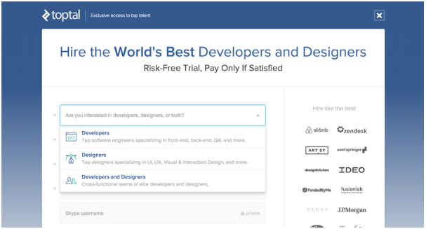
Icons and symbols can be used in your forms to help your visitors along faster. One example from TopTal uses colourful icons in their drop down menus along with a little Skype security symbol so that users know their information will be safe.
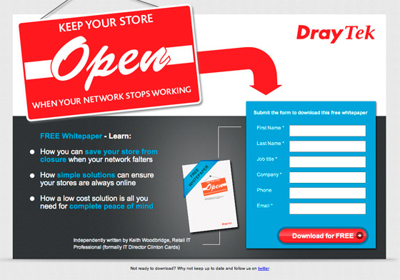
7. Utilize Arrows as directional cues
Using visual and directional cues are little persuasive tools to help your visitors along the way to a conversion. We’ve all be conditioned to follow arrows when they’re put in front of us.
Because most of what web users do is scan websites, it helps to have visuals to direct their eyes towards your conversion goal.
The landing page below, with its huge hero image, immediately directs your eyes towards the form on the right side. The colour sticks out and the thin white line leads in that direction once you’ve read through the body text of the landing page.
8. Break up long forms into multiple pages
If there is no way around collecting a large amount of information on a form, a two step form might be the solution.
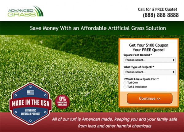
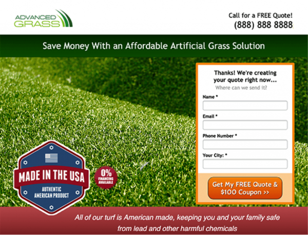
KlientBoost performed an experiment on a client by adding a two step form and saw conversions increase by a whopping 214%. Instead of one huge form they broke it up into two steps.
By splitting up the form into two steps they were able to capture a small amount of information first, then ask for more once the first step was completed.
They found that once a bit of information was entered, the visitor was already invested and would more likely continue filling out the rest of the fields.
Page one:
Page Two:
9. Formstack’s 2015 Form Conversion Report found that single page forms converted at 4.53%, whereas multi-page forms converted at 13.85%. A 3X improvement!
Why?
Longer forms are broken up into separate sections.
Multi-page forms typically include a progress bar to let users know exactly how far along they are.
Because they are broken up the fonts, fields, and images are all larger. More space makes these forms more digestible and less intimidating.
10. Use a Progress Bar for multi-page forms
A progress bar to tell your users how far along they are in the form process can have a powerful impact.
Consider the Zeigarnik effect, the theory that people remember incomplete tasks better than complete ones. Bluma Zeigarnik noticed that waiters had a far easier time remembering what unpaid tabs they had compared to recalling the ones that had already been paid.
A progress bar lets users know how much of the task they’ve already completed and how much they have left. It plays on the fact that users are less likely to leave the task unfinished if they know how far they’ve come.
11. Use a ‘wiggle’ button to draw attention to your form
Form animations are another great visual cue that directs visitor eyes to your conversion goal. Having a ‘wiggle’ type animation on something like the CTA button or headline is a fun way to draw attention to the most important part of your form. Animations can be done easily with a bit of CSS code.
12. Form Encapsulation
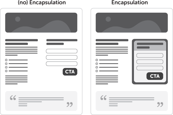
Form encapsulation is the design practice of placing your form in a container to highlight what’s inside.
A thick border or a colourful frame will draw the attention of your visitors more than a form that simply blends into the page. Consider something like a heavy stroke or a drop shadow behind your form to draw attention to it.
13. Match field and button alignment and length
Design is a powerful factor when it comes to the effectiveness of your form. Your button or CTA should be a prominent element on the page.
Proper field and button alignment and length are important to make sure the conversion process is complete.
In the example below, the form is not encapsulated and blends into the landing page. The button is out of alignment and isn’t immediately recognizable as a CTA. A different background would help the form standout from the rest of the landing page.
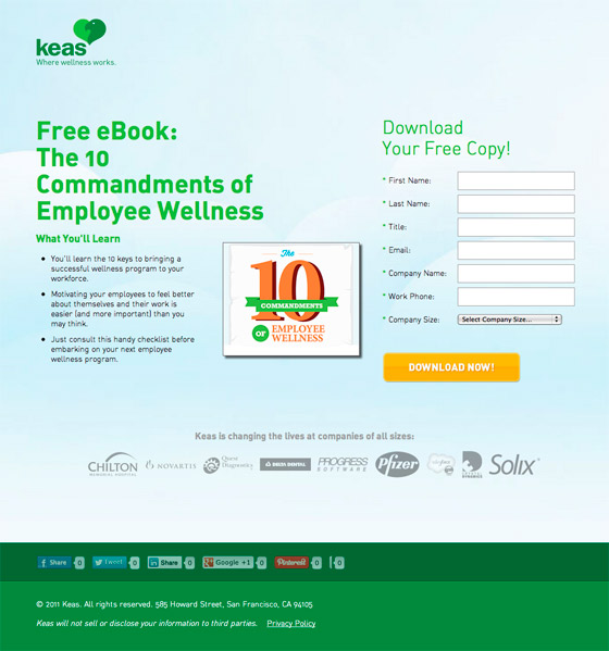
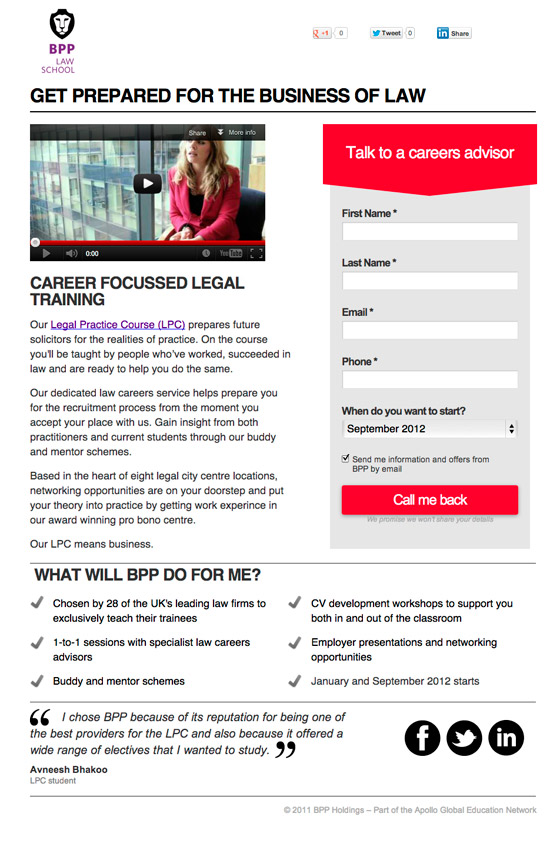
The colours and encapsulation of the form example below draw the user eye towards it. The CTA is immediately recognizable and easy to identify as the last step in the submission process.
14. Don’t encapsulate your fields and not your button
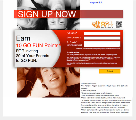
If you’ve made the decision to encapsulate your form for more presence on the page, then don’t make the mistake of not including the button as well.
In the example below the submit button doesn’t look like it’s a part of the form. The large block of text above and below mask the button and may confuse the user. Your button should included along with the form for simple submission.
15. The impacts of colour — Red means error (and bad feelings ensue)
As was said before, encapsulating your form can really help to draw in a visitor’s attention.
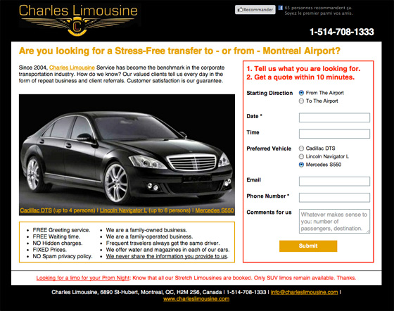
The use of colour on your forms can also impact the way users interact with the form. On a form specifically, red is associated with an error. Therefore using the same tone of red might confuse a user as in the example below.
The use of red on this form, aside from being an eyesore, is immediately confusing if the user has not already entered any information. The use of colour here would convert less than a more subtle background colour or drop shadow.
16. Replace Dropdown menus
Dropdown menus can be a powerful navigational aid for visitors by eliminating the need for a new page to load. Intuitively, dropdown menus are said to decrease the navigational friction when exploring a website.
In a A/B test by VWO, they removed a large drop down menu in favour of a complete product directory page. Because the drop down menu contained only product category text links users, seemed to get confused with the industry jargon which wasn’t sufficient enough for them to take action.
By including descriptions and product images on a product directory revenue increased by 56.43%. By going against convention and experimenting they were able to lower friction for their users and increase sales.


Wishpond’s 1000+ Lead Generation
Strategies, Ideas, Best Practices & Examples
Click below to download the most comprehensive collection of lead generation strategies and examples ever compiled. Completely free.