Lead Generation Forms: 50 Strategies, Ideas & Best Practices Part 2
Form Copywriting Tips
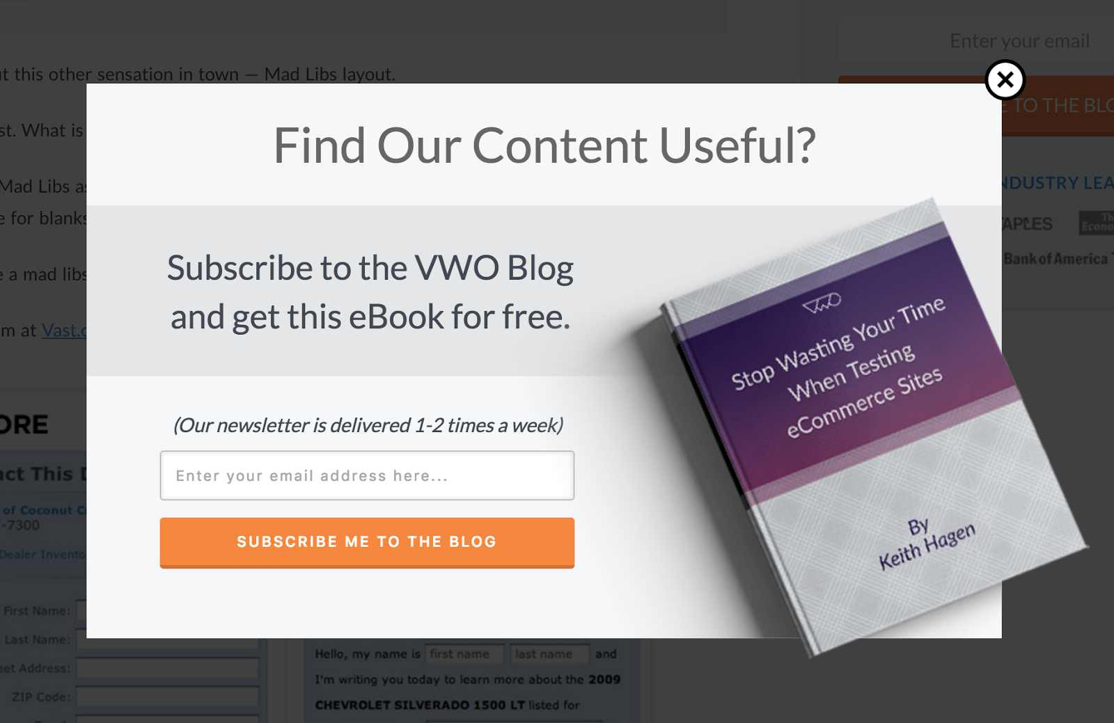
17. Tell the user what to do in each form field, instead of just labelling each with what you want them to enter in
Simplify the form filling process by pre-filling your form fields with instructional text. Instructions will clear up much of the confusion of filling in lengthy forms for your visitors.
To avoid any friction, each form field can have text like “Enter First Name Here” or “Enter Email Here” to guide your visitor along.
18. Match Form Headline to Button Label Text
When optimizing your forms for maximum conversions the better you can match the expectations of your visitors the better their experience will be. If you match your form title to the button label text there will not be any confusion as to what your visitor is receiving once that button is clicked.
A form for your new ebook “40 Best Social Media Marketing Tactics” should match the button label text “Get the 40 Best Social Media Marketing Tactics”. It will avoid any miscommunication by telling your visitor exactly what they’re getting.
19. Add benefit to button label
A small change can add a substantial amount of improvement to your forms. A tiny A/B test performed by Streamline Metrics showed that by changing to benefit oriented button text it improved conversions by 36.3%. Formerly “Submit”, they changed the button text to “Get Quote Now” and saw a marked increase in form submissions.
Small text changes can have big impact on the expectation of your visitor. Using benefit oriented communication will provide more of an idea of what your visitor can expect once they click the button. Something like “Submit” is very ambiguous whereas “Get Quote Now” is exactly telling of what is going to happen next.
20. Use an Action word on your Button Label
Using an action word on your form submission buttons are effective because they match the physical action of clicking a button.
Using action words are congruent with the actions your visitors are making on your forms. These words provide precise information on how your visitors are getting from A to B.
Words like start, stop, create, build, learn, or get are powerful indicators of what action your users are about to accomplish.
21. Submit Button Conversion Metrics
There is no such thing as “the ultimate CTA button”. Granted, there are ways to make your button more appealing depending on the type of text you use.
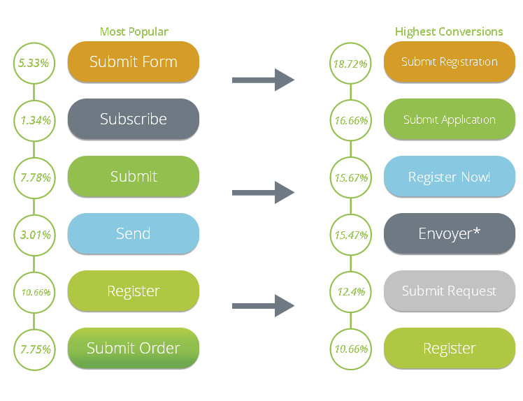
“Submit” is and always will be a popular button text and by improving the specificity of “Submit” you’ll see that conversion rates improve.
According to FormStack, elaborating on what action visitors are about to accomplish increased conversion twofold. The graph shows below the most popular “Submit” buttons versus the highest converting “Submit” buttons.
22. Words to Encourage Community/Sense of wanting to belong (on Button)

“Join”, “Become a member”, “Come along” are calls-to-action that create a sense of community and belonging. According to basic psychology principles people yearn to be part of larger social groups.
As Buffer does at the end of their opt-in form, if your new visitor is submitting their email for example, “Join 30,000 other marketing pros” will make them feel part of the larger picture. They will be part of an “exclusive” group of in-the-know people and be privy to the best information.
23. Don’t bring up ‘Spam’
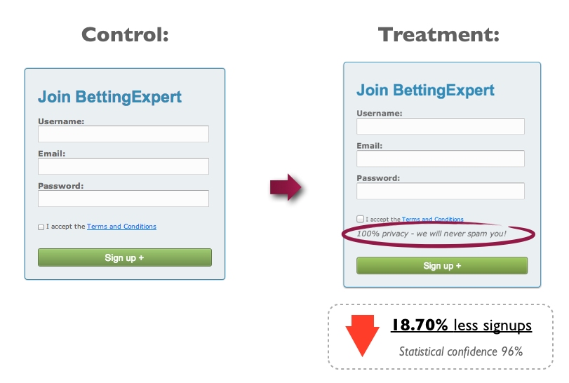
If you’ve mentioned spam anywhere on your form, you might want to reconsider.
In this particular A/B test, the added text below the button said that they would ‘never spam you’, lost, showing that just putting the idea in the person’s mind that they could be spammed led to a decrease in conversion rate.
24. Yes, Placement above-the-fold matters
When it comes to form placement on a webpage, there isn’t a place much better than above the fold.
Above the fold meaning the area that your visitor lands on before they start scrolling downwards.
In a study by the Nielsen Norman Group, they found that content above fold was viewed 102% more than the content below the fold.
In other words, place your most important content, like your form, above the fold if most of your visitors are bouncing before viewing the content below.
25. Avoid ambiguous button titles
When thinking about proper communication on your buttons, it is best to stick to phrases that are benefit or action oriented to help your visitors understand their next steps.
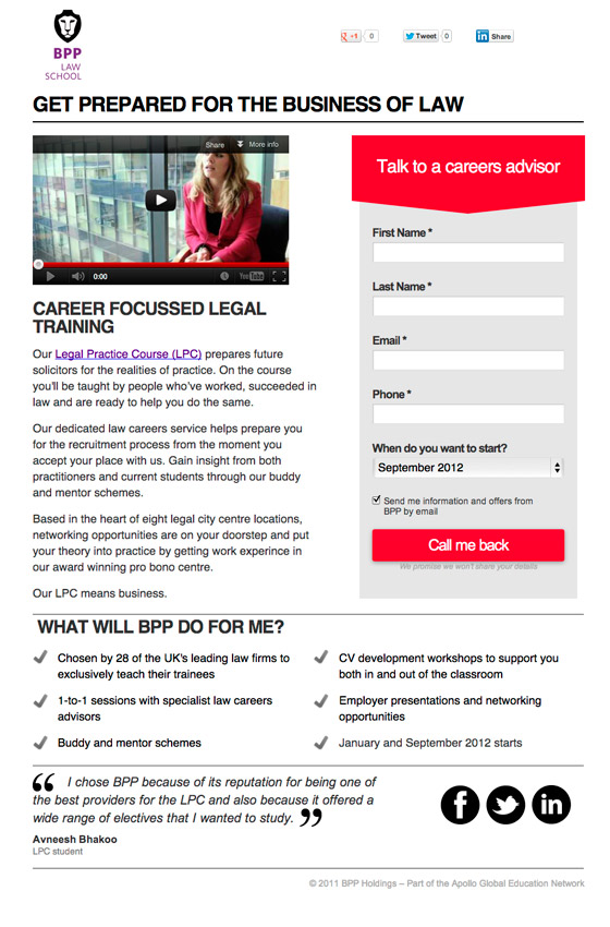
Ambiguous or confusing languaging may create some hesitation to submit a form.
In the example below, the button text is immediately confusing on first look. “Call me back” doesn’t reference anything about receiving a phone call on the landing page. How could I receive a call back if I never called in the first place? Instead “Request my quote” or “Get more information” would have been a more clear call-to-action.
Technical Form Tips
26. Focus on first form field
To make the task of filling out your form a little bit easier for your visitors you can set your forms to auto-focus on the first form field when the page loads. This way the first field is already selected so that your visitor can start typing their information into the field instantly.
27. Dynamically replace text based on AdWords Keyword
If you’re advertising with search ads on Google AdWords you can dynamically replace the text on your form with your focus keyword.
The key here is that maintaining text consistency throughout your ads, landing pages, and forms will all contribute to a better conversion rate. The better you can match the expectation of your visitors to what you’re offering them, the more comfortable they will be with providing their information.
Imagine an ad promoting easy landing page building software. With a bit of liquid text you can replace a portion of the headline with the keyword: landing page building software. This way a person searching for landing page building software will see that exact keyword in the ad text, landing page and form headline, and on the button.
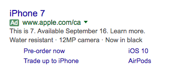
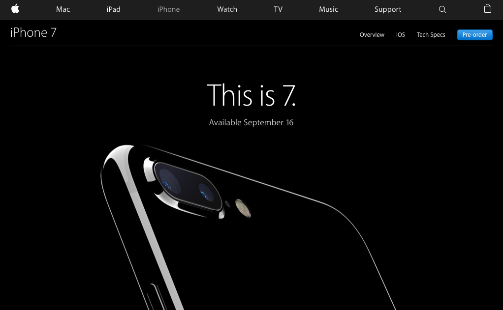
Apple, with many of its hardware offerings, can use liquid text to replace the headline of their ad to the headline of the landing page. This way they’ll be able to see which ad and headline converts best for the iPhone when they’re A/B tested against each other.
28. Real-time Line Field Validation
Have you ever took the time to fill out a painstakingly long form, only to have the page reload and not submit because of errors, or worse, it deletes all of your entries?
A form with poor error feedback can be a frustrating problem for the majority of web users. If your users can’t figure out which form field they’ve made an error in or are forced to re-enter all of their information, they’re more than likely to abandon the whole process entirely.
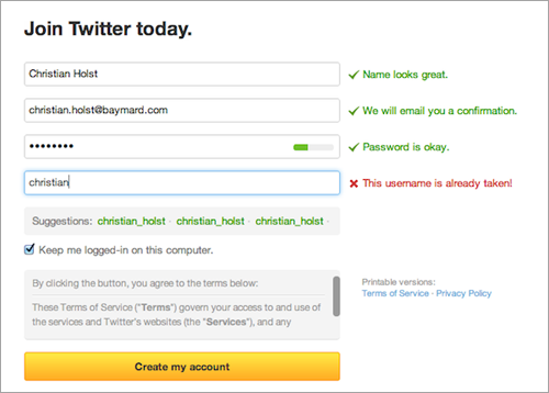
Real-time line field validation is the method of updating visitors with feedback as they make their way through your form. It’s making sure that each field is filled out correctly and alerting your visitor of the problem.
On the Twitter account creation page, each form field is updated independently and gives new visitors real-time validations. It prevents the page for having to reload and the visitor having to reassess where they are in the account creation process.
29. Add Anchor Links to Forms in long landing pages
The user interface and navigation plays a large role in the conversion rate of your form. Making your form easy to locate is an quick way to increase your conversion rate.
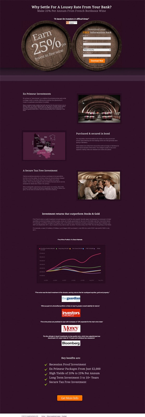
Anchor links placed throughout your landing page can quickly send users back to the location of your form. If you’re using a long landing page, it may be difficult for your visitors to locate your form on the page. Anchor links that break up the page and act as tiny redirects to your form.
The landing page below has an anchor link at the bottom of the page that sends users back to the top of the page where the form is. It helps them avoid any navigational confusion and redirects to the most important part of the page — the form.
Form Example Critiques (30-50)
30. In Click-Popup (click link to see): ClickFunnels
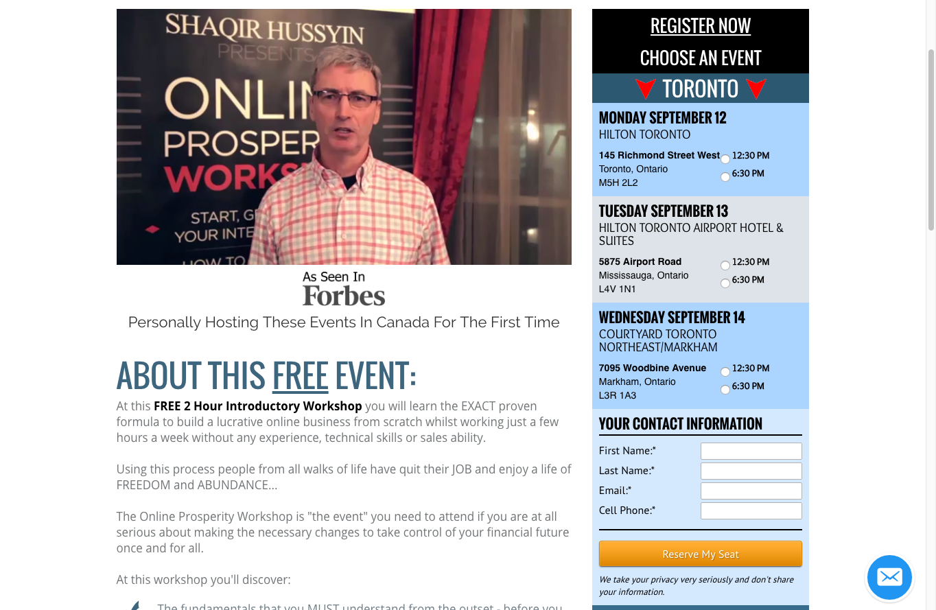
This free event workshop landing page uses a dropdown form to register attendees.
Because of the massive amount of text, colours, font weights and images, I had trouble locating where the form was placed. Clicking on the anchor button to register at the bottom did nothing. The design hierarchy could have placed the form in a more prominent position to make it easier to find.
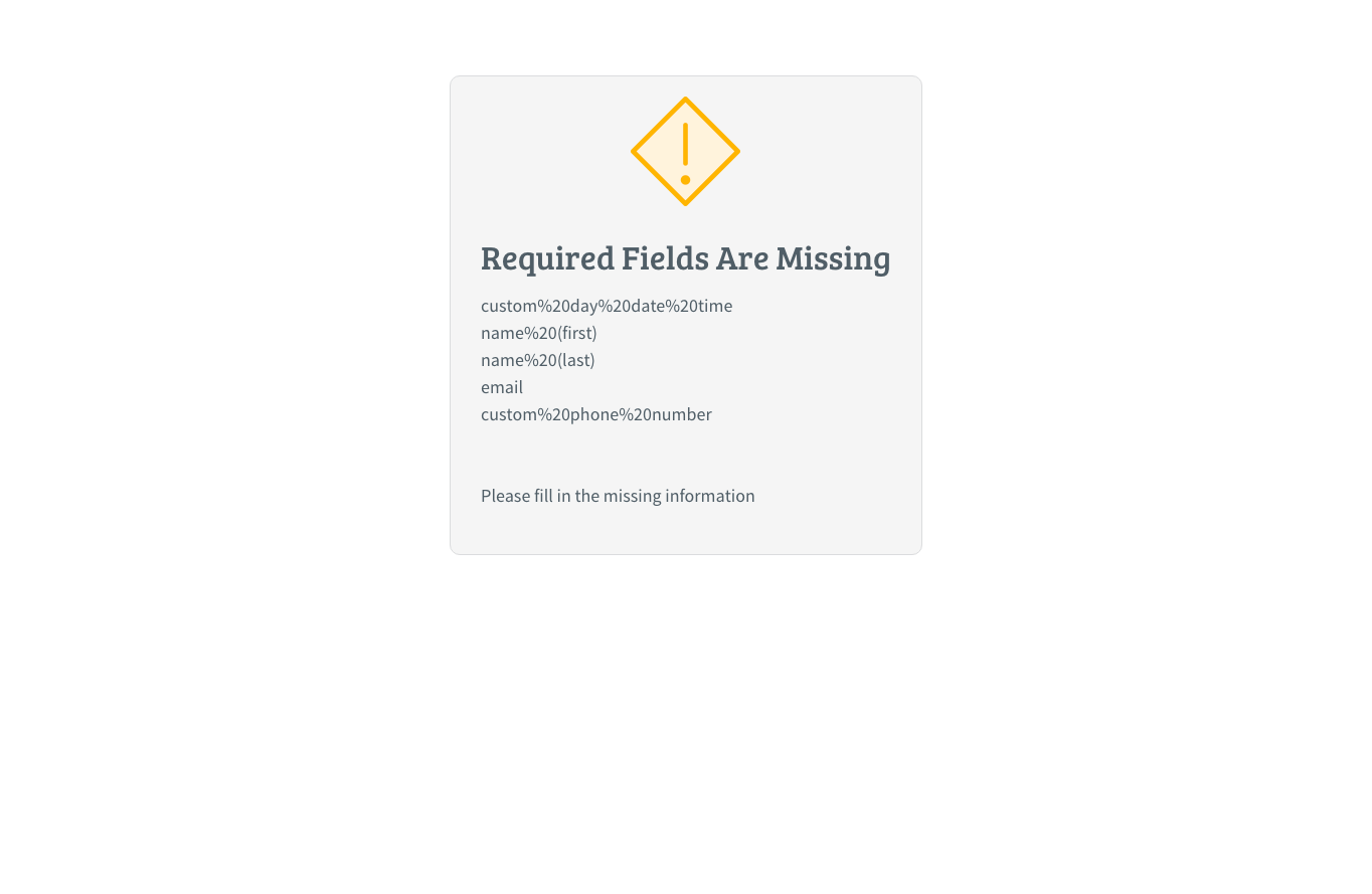
Another issue comes when you incorrectly fill out the form. You are redirected to an error page that tells you the mistakes you’ve made then forced back to reenter all your information.
31. Thinkific
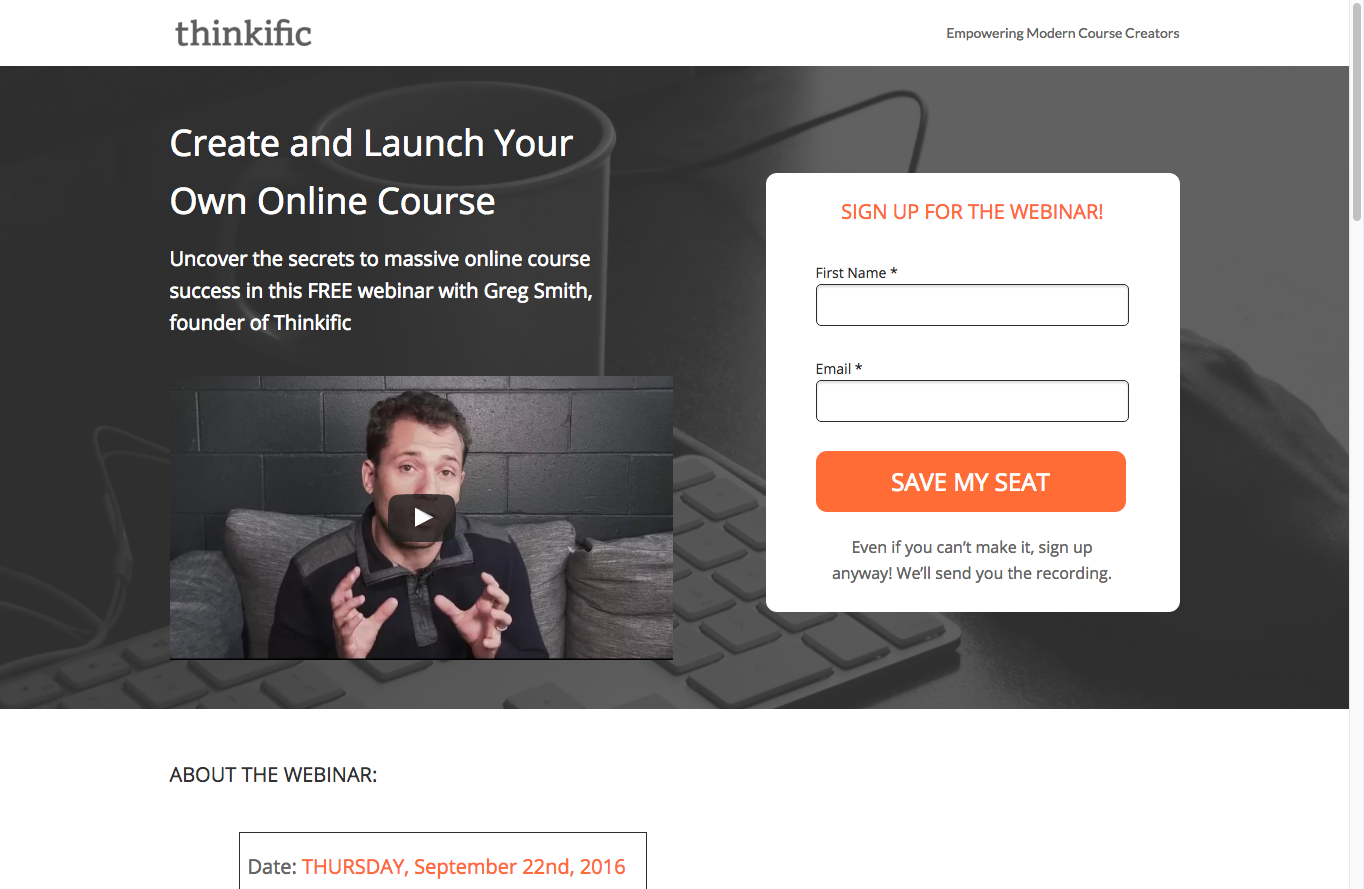
Thinkific does a wonderful job with their webinar landing page.
- The form is easy to locate and the design places it front and centre.
- The number of form fields is restricted to two.
- The button CTA text “Save My Seat” is action oriented so that registrants know they are saving their spot in the webinar.
- The anchor button at the bottom of the landing page sends users right back up to the form to register.
- The text below the button provides extra value by promising to deliver the video recording if one misses the webinar.
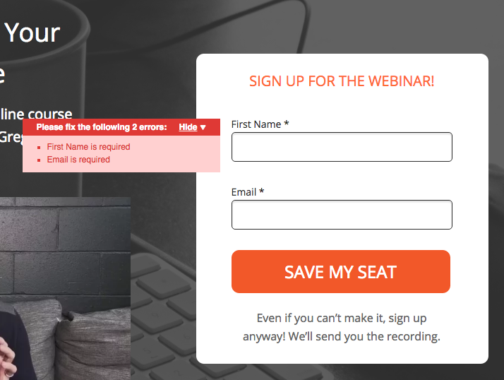
- Form errors are shown in real-time.
32. ConversionXL
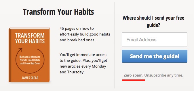
From what we noted earlier, spam is considered a stop word. Simply mentioning the word spam was immediately make your visitor stop and consider if spam is a legit possibility.
If you’ve built an excellent landing page and form, then spam will be the last thing on their mind. Eliminate the hesitation and friction by eliminating the use of the word spam. All that needs to be done next is not spam your opt-ins.
33. Exit Popup: Social Media Examiner
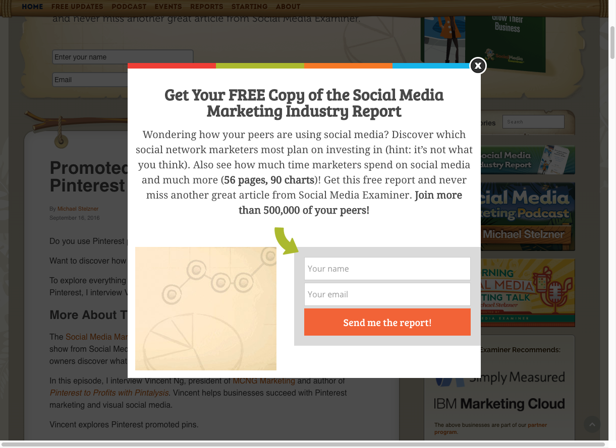
Using an exit popup to embed their form, SocialMediaExaminer uses key practices to make sure their form is performing at its best.
- Two form fields for a simple and easy opt-in.
- Bright orange CTA.
- Clear and concise CTA language, “Send me the report” to tell opt-ins they will instantly receive the report they want.
- Form encapsulation to highlight it on the popup.
- A green arrow to direct visitor eyes to the form to opt-in.
- Persuasive language and highlighting on the popup for those who scan and to increase visitor confidence, “FREE”, “59 pages, 90 charts”, “Join more than 500,00 of your peers”.
34. Aweber
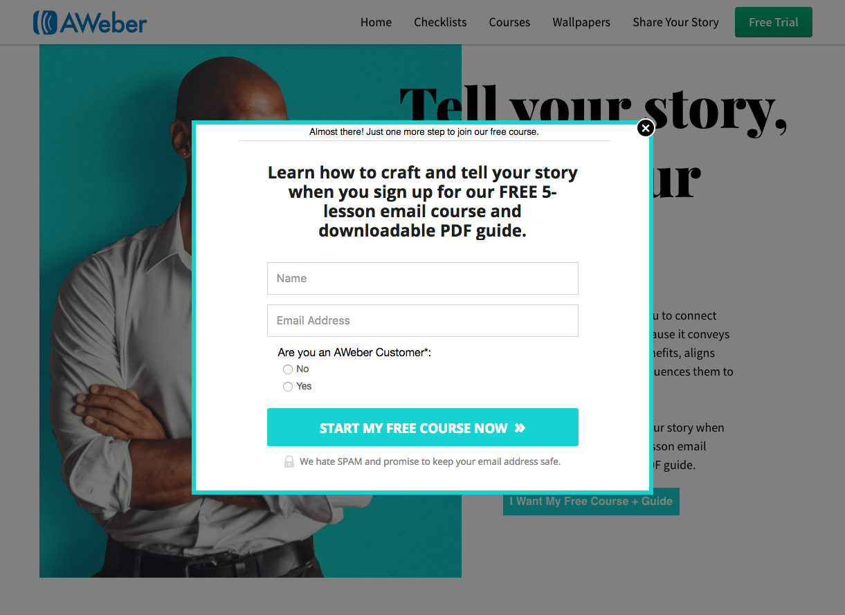
To register for AWeber’s free 5-lesson email course they employ a click popup form.
AWeber is doing everything right with their form:
- A progress comment “Almost there! Just one more step to join our free course.” It tells visitors how far and how much more there is left in the opt-in process.
- 2 form fields and one check box for easy segmentation.
- Powerful action oriented CTA “Start my free course now”
- Bright eye catching colour and clutter free design
One comment is that they do mention spam below the button which may hurt their conversions but it could only be proven by A/B testing.

Wishpond’s 1000+ Lead Generation
Strategies, Ideas, Best Practices & Examples
Click below to download the most comprehensive collection of lead generation strategies and examples ever compiled. Completely free.