
Sales Lead Generation: 75 Strategies, Ideas and Examples
Not every visitor is ready to buy, nor every lead.
That’s why the most successful digital marketing teams have one strategy for generating marketing qualified leads (we have 100 ideas about that) and another for generating sales qualified leads (that’s this comprehensive guide).
Sales qualified leads are worth more than a marketing qualified lead. They’re closer to the finish line.
But getting them and keeping them can be a challenge.
This article will give you 75 strategies – with actionable how-tos and examples – for your business to generate leads that are ready to talk to sales.
We’ll break down “talk to sales”-type call-to-actions as well strategies to convert existing leads into sales leads.
You’ll see optimized product demo pages, CTAs, one and two-step funnels, competitor alternative landing pages, product webinars, bottom-of-funnel blog content and much, much more.
I’ll give you ways to optimize them all on top of formulas, email templates and ideas to A/B test.
Let’s get rolling.
Strategies & Ideas
- Run a Product Webinar
- Show Pricing on Demo Signup Page
- Simplify your Product Pages
- Ask for Micro-Commitments
- Shock with a Macro-Commitment
- Use Video
- Make your Headlines Super-specific
- Free Assessment
- Free Expert/Automated Review
- Add Testimonials
- Buyer’s Guide
- Example-based content
- Solution Comparison Page
- Customer Case Studies
- Inline Blog CTA for a Demo
- Add an Exit Popup on Pricing page
- Change your Sales CTA
- Test “Free” in your Demo Signup CTA
- Anticipate and Directly Counter Objections
- To Be Secure/Out of Fear
- To Make Money
- To Save Money
- To Save Time
- To Make Work Easier
- To Gain Knowledge
- Because it’s Better than What our Friends Have
- Because it’s New
- Because We Trust The Brand
- Out of Guilt/Reciprocity
- Because of a Limited-time Discount
- It’s Aspirational
- Promote a Limited Time Offer at the End of Webinar
- Determine your Highest Value Content
- Follow up with Leads who Visits your Pricing Page Multiple Times Within 15 days
- Use a 3-to-1 Ratio of Templated to Personal Format Emails
- Send Next-step ‘Content Upgrade’ Emails After Leads Visit Specific Blog Posts
- Segment Leads Based on Use-case for Your Solution
- Use Inspirational Content to Move Leads from Early-stage to Late-stage
- Highlight your Competitive Advantages to Mid-Stage Leads
- Personalize your example-based content
- Don’t Send Automatic “Personalized” Emails During Non-Office Hours
- Only Have One Call-to-Action Per Email
- Retain Whitespace Around your Email CTA
- Keep Your Emails Short and to the Point
- Don’t Make Leads Fill Out the Same Form Fields Twice
- Don’t Include Your Business in From Name
- The 9-word Re-engagement Email
- Provide Alternatives to Incomplete Actions
Examples
- Showpad Free Trial Landing Page
- Salesforce‘s VIP Demo Landing Page
- Jon Loomer‘s Segmented Webinar
- Neil Patel‘s Customer Acquisition Webinar
- California Closet‘s Design Consultation
- Brian Jessel BMW “Request More Information”
- Kissmetrics’ Try-before-you-buy, then Talk
- Frank and Oak‘s Pre-sale Signup
- Frank and Oak‘s Free Stylist Session
- LinkedIn‘s B2B Sales Leads Demo
- BluePond’s Free Site Assessment:
- Vancouver Solar Energy System’s Discount
- Vancouver Condos For Sale’s Request a Home Showing:
- Rich Dad Coaching’s Free Report + Introduction:
- Online Trading Academy‘s In-Person Workshop:
- BrainStation’s Request Course Syllabus:
- BrightonCollege “Get Program Details:”
- RedAcademy’s Request Info
- KlientBoost’s Lead-Specific Proposal Questionnaire
- Automic’s Solution Guide:
- Oracle’s Interactive Product Demo Video:
- Nimble Storage‘s Product Specifications Whitepaper:
- Tintri’s 3rd-Party Industry Solution Report:
- CIBC Bank’s Mortgage Calculator and “Pre-Approved CTA”:
- Steve Nash Clubs’ Free Trial:
1. Run a Product Webinar
Product-focused webinars are less high-pressure than a one-on-one demo. And with a Q&A session at the end, your leads have the opportunity to ask any questions they have (and hear the answers from questions they didn’t think to ask).
A recommended strategy for this is to run four webinars a week: Tuesday at 11am EST, Tuesday at 11am PST, and then two more on Thursday.
And you can use the same copy in your email or website CTA:
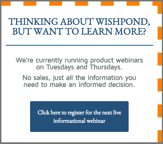
Not all your leads are ready to commit to a sales call. They feel like they’ll be put on the spot, talking to some greasy salesperson whose only focus is that commission. A friendly webinar host, though, a “Customer success lead” – that’s far more appealing.
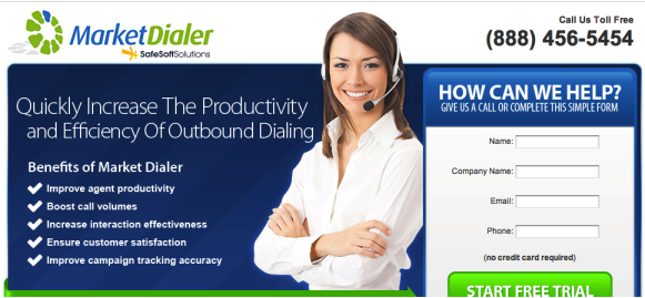
2. Show Pricing on Demo Signup Page
SafeSoft Solutions ran an A/B test on their product landing page which showcased the pricing page.
Here’s the control:
And here’s the tested variation:
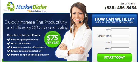
Featuring that “$75 per seat” in contrasting colors doubled conversion rates.
Why did this A/B test work so well?
People assume that if pricing isn’t displayed and they need to book a sales call, it’s likely a very expensive product.
Otherwise why wouldn’t it be displayed prominently?
The variation didn’t hide anything. In fact it displayed the price as prominently as it did the CTA button.
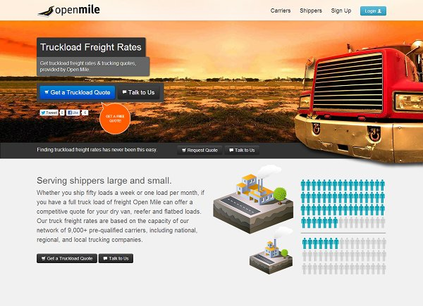
3. Simplify your Product Pages
OpenMile, a company which helps businesses calculate freight shipping costs, wanted to test their “Get a Quote” landing page. They ran a full multivariate test with an entirely different color scheme, button placement and, chiefly, a simplification of the image and above-the-fold.
Here’s the control:
And here’s the variation:
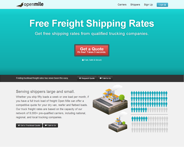
The variation won, increasing conversion rates by 223%.
Why did this work?
- Putting the CTA button front and center and removing the alternative
- Simplifying the page by removing the image and center aligning/adding contrast to the header and subheader
- Removing the color contrast on the “login” button, which was distracting visitors
- Adding “It’s Free” to the CTA copy and headline (see Sales Lead Generation Strategy #18 for more on the word “free”)
- Adding “Takes 5 seconds” to the CTA Copy
4. Ask for Micro-Commitments
Social psychologists call micro commitments the “foot in the door” technique or, if you’re really fancy, “successive approximations.”
Essentialy, micro commitments get your brand’s foot in the door with a small request. IF you can get that small “yes,” all subsequent requests are easier to get.
Provided you can get an initial piece of information from your lead (9 times out of 10 that’s an email address) the successive pieces of lead information become easier to get (ideally, until the point at which they make a paid conversion).
How to do it:
Using “pre-filled” form fields, you’ll fill each lead form with the information you already know. Only unknown information fields will be empty.
For all the non ‘top-of-funnel’ gated content in your funnel, include a bunch of lead generation fields, but be sure to make them all pre-filled.
Sources:
5. Shock with a Macro-Commitment
The door-in-the-face conversion strategy requires a bit more creativity on your part.
Instead of asking for a small conversion (email address), ask instead for something crazy – like a social security number.
Then, when someone goes to leave, try an exit popup which says “We were just joking! Get this [lead magnet] by filling in your email address, nothing else!”
The Door-in-the-Face or “Macro-commitment” strategy works by shocking your prospective leads with an outlandish request. This request ensures that any subsequent request is, in contrast, almost meaningless.
Here’s a couple examples to show you what I mean:
- Hey Carol, can I borrow $10,000?
- What? Of course not. I can’t loan you $10,000!
- I guess you’re right. How about $10. Surely you have $10?
- Phew. Yeah I have $10 right here. Let me grab my wallet…
OR…
- Hey Carol, really appreciate you letting me borrow your car.
- For sure. Anything happen?
- Actually… Unfortunately I got in a pretty serious accident on the freeway. Car’s a write-off.
- What? Are you out of your mind? You didn’t tell me!?
- Ha. No I’m just joking with you. There is a small scratch on the driver’s side from when it was parked on the street though.
- Christ, you scared the hell out of me! No problem about the scratch I’m just glad you’re alright!
- Hey Carol, really appreciate you letting me borrow your car.
6. Use Video
The reach and audience size of YouTube is untouchable. Don’t get me wrong. If you’re looking to reach out to new prospective customers and have an awesomely educational video, go to YouTube.
But YouTube is useless when it comes to lead generation – and that’s where a tool like Wistia comes in.
Wistia (and tools like it) allow you to stop the video and ask your viewers to fill out a lead form in order to continue watching or subscribe to receive the next one.
How you can implement this strategy:
- Create a 5-part course and promote it with Facebook Ads, social media and your blog.
- Leave the first one free and awesome.
- At the end of the first video, add a lead generation form which email-gates the rest of the videos.
- Alternatively, put the email gate halfway through the first video (if it’s long).
Customize your gate (Wistia refers to this tool as “turnstile,” by the way) with value-communicating copy and a couple fields (email and name, tops).
To learn more, check out Wistia’s breakdown of their “Turnstile” feature.
7. Make your Headlines Super-specific
Don’t ask your landing page or website visitors fight to find the value of your offer. Put it front and center, specific and directed at your target market.
A few examples you can test…
- Be specific about your target market. Instead of “Get the Top Content Marketing Strategies for Next Year” go with “To the content marketer planning next year, get the top strategies thought-leaders are banking on.”
- Instead of “Our software helps your company succeed”, try “Our customer intelligence software has helped 44 businesses at least double their lead conversion rates in Q1 alone.”
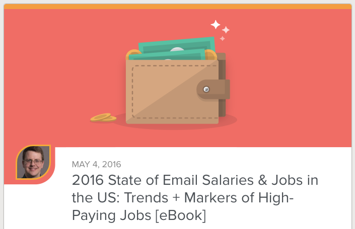
- Instead of “The Complete Guide to a Career in Email Marketing,” try “The 2016 State of Email Salaries and Jobs in the US: Trends + Markers of High-Paying Jobs”
Source: Make The Headline Better: Advice from 6 Copywriting Legends
8. Free Assessment
The very popular website SocialTriggers uses the free assessment as one of their main sales lead generation strategies.
Essentially, it’s a simple sidebar CTA on the blog:

And here’s the tested variation:
Clicking this brings up a six-page popup: five multiple-choice questions (which segment leads) and a sixth page which email-gates the results.
Derek then sends his new leads with a segmented email which describes what kind of entrepreneur they are, gives them an example of a well-known entrepreneur who is also that type, and breaks down exactly how his consultancy and training series can help them.
There’s a few things in this lead generation strategy which are awesome:
- Segmenting leads through a questionnaire, rather than form fields
- Giving leads the perception that they’re part of a cool group (see the psychological factor of “labelling” in my ultimate guide to conversion rate optimization).
- Communicating on a semi-individual basis through segmented email campaigns
- Using the word “free” which implies it’s going to be valuable but you get it for free
- Using the question in the CTA image to hook viewers.
9. Free Expert/Automated Review
Position yourself as the expert in your industry and offer a free review of, for example, landing pages, a meal plan, etc.
This works really well at the bottom of an article or in-line after a critiqued example. Add a yellow background div with copy like this…
That link text would open a click popup which would ask for email address and name, page URL (or a picture of the thing to be reviewed) and maybe business name.
And the feedback would be both expertly insightful and also reveal that the prospective customer/new lead could really use a service which makes it easier to do [X]…
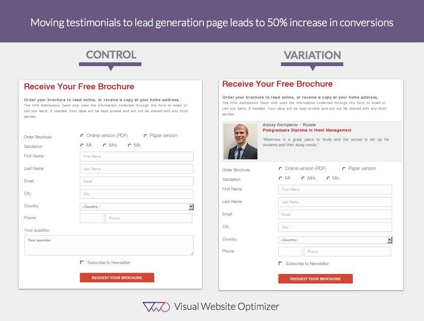
10. Add Testimonials
Testimonials are as unbiased as you can get on your own website.
They’re the digital version of word-of-mouth marketing, equivalent to having someone stand in front of your (clearly biased) brand saying “I worked with them and you can trust them to follow through on everything else you see here.”
And they’re real people with names and faces. They’re not anonymous (or shouldn’t be if you’re optimized). They’re relatable. They’re like your prospective leads or customers and what they say has more weight than what you do.
Here’s a case study from Visual Website Optimizer where a user improved their lead generation page’s conversion rates by 50% with the addition of a testimonials:
To learn more, check out “Landing Page Customer Reviews: The How the What and the Wherefore”
11. Buyer’s Guide
A buyer’s guide is one of the top sales lead generation magnets. It provides all the information a business or prospective buyer might need to make a decision about your business:
- Product specifications
- COmpetitor comparisons
- Customer testimonials
- Business ethos
Essentially, the role of a buyer’s guide is to address any concerns or questions a prospective buyer has with an overwhelming amount of “No, because.”
You give buyers exactly what they need to make the most informed decision they can.
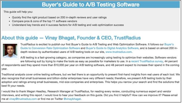
Source:How B2B Marketers Can Create Buyers Guides to Control the Buying Process
12. Example-based content
Our own data shows that example-based content converts better than our blog’s average.
Articles with examples (or at least the word “example” in the URL) convert 38.9% better than the average article on the Wishpond blog. And yes, we have enough traffic for that to be statistically significant.

Example-based content serves as both top-of-funnel content (for people interested in learning more about a subject and seeing some examples) and bottom-of-funnel content (for people ready to execute a strategy and needing some final inspiration for making their campaign successful.
And if the examples you show are either made with your software or feature it, then you’re the next logical step for those bottom-of-funnel visitors.
13. Solution Comparison Page
I wouldn’t actually recommend that you email gate your platform comparison report. Instead, make it extremely visible.
What you should do is make a VIP demo extremely accessible from that page.
Think about it: if someone is viewing your competitor analysis page or report then they’re trying to make a final decision about your business. Your comparison report is going to put you in the best possible light, and that might be enough.
But why risk it? An optimized comparison page should feature all the information and, in every section, a CTA to talk to a representative. You need to make it easy for your visitors to ask any questions they might have or clear up any confusion.
14. Customer Case Studies
Your business is, likely, already aware of the value of case studies for middle and bottom-of-funnel lead nurturing.
It’s a big part of convincing prospective users that they can find success with your service or software – but it’s essential that you’re creating case studies for as many different industries as you can.
Case studies are extremely effective if delivered to leads based on their stated industry: relevant is more important than anything else.
Ask your leads for their industry (use a dropdown in your landing page) and then create individual email drip campaigns based on each of those industries which include a case study relevant to them.
15. Inline Blog CTA for a Demo
Let me give you some context with this one, because a “Book a Demo!” CTA in the middle of your article won’t fly, and your readers will hate you.
Instead, try something like this:
The copy here is, essentially “we recognize that this actionable strategy might be a bit complex. We’d love to help you make it happen. Click here to book a time for one of our marketing experts to explain the details.”
And that’s not a hard message to agree with. If your customer success or marketing expert happens to mention that your platform is built to make part of the complicated strategy easier, whose fault is that?
16. Add an Exit Popup on Pricing page
We’ve recently finalized an A/B test which added an exit popup ot our pricing page which prompted visitors to book a free VIP demo before committing.
As an exit popup, it was only shown to people who were leaving anyway – it’s what we call a “lower-value conversion.”
Here’s the results of that A/B test:
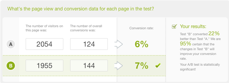
That 22% increase translated (we’re talking about our Pricing page here) to many thousands of dollars/month in revenue.
An exit popup on Pricing is an aggressive move, but so long as your offer is relevant (a demo, an upcoming product-focused webinar, etc) it can go a long way towards increasing your signups, and that’s worth it.
17. Change your Sales CTA
“Sign up for a Sales Call” is pretty intimidating. Your visitor clicks that CTA copy knowing they’re going to be sold to. They know they’re going to be talking to a professional whose only goal in life is to make commission.
In short, avoid the word “sales” at all costs.
Instead, try “Get a Free Quote,” “Request a Demo” or “Book a Time to Chat.”
You’re getting the same result, but optimizing the Ask and giving your sales associate a lead who’s less defensive and more open to a conversation.
18. Test “Free” in your Demo Signup CTA
The word “free” is one of only a few words that engages your website visitors at a subconscious level.
Here’s an awesome story from thought-leading neuroscientist and marketer Roger Dooley:
“The most interesting example of the power of “free” [comes from] Amazon.com. When they launched a “free shipping” promotion with the purchase of a second book every country except France showed a big jump in sales from the offer. The Amazon marketers investigated, thinking perhaps the French were rational enough not to be swayed into buying a second book. In fact, they found that in France the program had been slightly altered. Instead of zero shipping, the offer in France charged a mere one franc – about twenty cents. From a pure economic standpoint, the two offers are almost indistinguishable. In actual performance, though, the one franc offer caused no sales increase. (When the French offer was changed to FREE!, sales did indeed jump.”

The Variation:
“The A/B test was run on close to 800 visitors for a duration of 2 weeks. The improvement was astonishing. The variation emerged as a winner and recorded an increase of 99.42% in the click-through rate of the CTA button.”
Source: VWO
You’ve heard it 100 times, but hear it again: “Free” is worth testing no matter your industry, offer or campaign.
19. Anticipate and Directly Counter Objections
One of the best ways to address your prospective lead’s objections is to anticipate them and speak to them directly.
The most common objections:
- You’re too expensive
- My problem is unique and you don’t understand
- I don’t trust you
- What if it doesn’t work for me?
These objections can be easily found by using a third-party survey tool, simply ask (in an exit popup, perhaps) “Before you go, would you mind telling us why you’re leaving?” and a dropdown of common answers.
And then take those concerns and put the reason they’re crazy right up, face to face with your visitor.
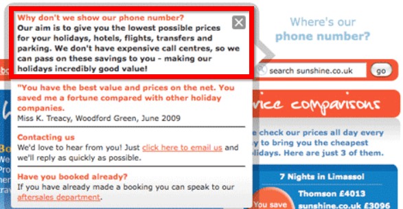
Here’s a great example from sunshine.co.uk (a vacation planning company):
Source: Conversion Rate Experts

Wishpond’s 1000+ Lead Generation
Strategies, Ideas, Best Practices & Examples
Click below to download the most comprehensive collection of lead generation strategies and examples ever compiled. Completely free.